

There are some brilliant websites that have been created with care, then others which are cringe worthy and seem to defy all logic and known design principles. While budding website designers are encouraged to explore their creativity, there are some who need coaching on what works, and what does not. Here are 10 design mistakes that you should avoid at all costs.
1. Too Many Colours
In the zeal to have an attractive, eye-catching web page some go overboard and overwhelm the viewer with bright colours on the text and borders, adding in numerous and unrelated images as well. This detracts attention from the main content. A good rule of thumb is to use a maximum of three main colours and a solid background. If you choose a textured background, ensure you choose complimentary colours that do not scream out like neon markers.
2. Improper Font Size
 This can range from fonts that are too minuscule to read, say a font size smaller than 12 points causing people to either squint or hit the back button. It is important to understand your audience, as persons above the age of 40 are more likely to need slightly larger font sizes. Older persons are believed to prefer font size 14 and up
Subject text also needs to broken down into more manageable chunks and not look like a piece of continuous prose. Quick nuggets of information and easy reads are what most people are looking for. In situations where you need to present large volumes of text, consider creating different pages to make the content more manageable.
3. Cluttered Content
Fervent use of a web page by filling it with all sorts of information from news feeds and other links can leave it looking cluttered and difficult to navigate. Typically, the eye goes to the company logo or branding, as this is an identifiable mark. It then moves to the header followed by the main body or content. Finally, it moves down the webpage and across the screen. If you do not take this into consideration, the eye has no proper pattern that it can focus on and the viewer gets confused.
4. Using Animated GIFS
Animated gifs are fun to look at for a chuckle but are best suited for memes. Unfortunately, there are some odd websites that tend to have ignored that rule. Animated gifs should not be used on an official website under any circumstance, as it just looks tacky and juvenile.
5. Assuming Users Will Zoom in to See Your Content
Most of us want information that is easy to access and only a minority of people will make the effort to zoom into a page if it interests them. If a user has to zoom in up to 200 per cent to actually read content, chances are they will not return. You need to test that you can read the text on all types of devices.
6. Not Making Your Site Mobile Friendly
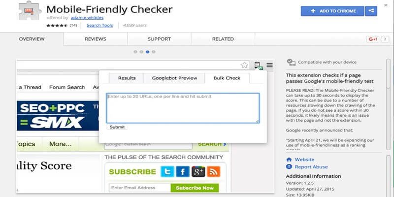
Smartphones are becoming the easiest and most convenient way to check out content on the internet. Chances are high that most of the traffic towards your site will be from a Smartphone or tablets. If the web pages are not optimised for mobile access people get frustrated as the content can appear cluttered or take too long to load. There are many apps and plug-ins available that help sort out this potential problem that are free and user friendly. A good example of a mobile friendly site is MailChimp.
7. Improper Use of Animation and Sound
In some situations, animation can help enhance the experience a visitor has on a website, though it must be done tactfully. There are situations where music can help, however you should not assume that everyone shares your taste in music or that they want to listen to the music. There are plenty of websites where animation or moving images are used without jarring.
8. Design Elements Not Cohesive
Never underestimate how important white spaces on a screen are, creating a balance for aesthetics. If the heading, side bar and bottom bar do not work together, it does not matter what else is on your website. A common mistake is to sneak a long list of pages and sub menus on the side, which is distracting as the eye picks the imbalance immediately or to clump all the information on one side.
9. Not Testing Repeatedly
Since people use multiple interfaces and devices, you cannot slack off by just testing the website once. Sometimes it can appear slightly different on different operating systems, and you must account for these variations. All the links need to work, otherwise it is a missed opportunity to keep people on your website and content.
10. Complicated Registration Forms or Registration Process
Should you need a registration process please keep it as simple as possible, most users are not interested in registering for a product or service if they have to either fill loads of information or have a complex and tense experience if you disable keyboard support.
You should put in considerable effort when you are building your website. The main purpose is to attract repeat visitors who interact with what you are selling or talking about and ultimately to generate income. When you design your website, it is very easy to get carried away and only consider your personal tastes, however in the role of the designer you need to consider what your target audience wants and needs. Keep tabs on design trends and it will be a breeze.