
The one thing that is always constant is the change, therefore, it is reasonable to say that there shall be changes in website design this 2016. Web designers are becoming more innovative, and the concepts and techniques that are emerging are thrilling. These original ideas ensure that it is possible to create a stunning website, with basic templates and excellent tools. Here is what you should expect in 2016 web design, including what stays, and what has got to go.
The Haves
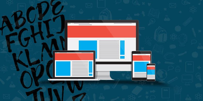
1. Responsive Websites
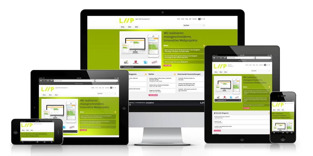
More and more people are gaining access to the internet and websites using mobile devices, and therefore, the first thing you should ensure is that your website is responsive. This means that the design needs to function well on mobile devices. Ensure that you pay attention to the text as well as the images when creating these sites, as the page needs to be light in weight for faster loading. For the most part, brilliant responsive websites are minimalist in nature to ensure that they can fit on various screen sizes.
2. More Flat Design
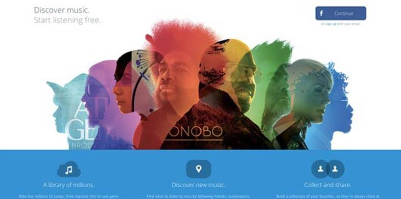
The growth in responsive designs has also led to the rise of flat design, which will continue to dominate in 2016. Flat designs are easier to read on devices and screens of all sizes, and they are less heavy allowing for faster loading of a website. This means that the flat design is much more effective for a positive user experience. To amplify websites that feature flat design, color schemes are likely to become more vibrant, a minimalist approach will be taken through simple fonts, and added shadows will be used to add depth if necessary. In addition, ghost buttons are going to increase in popularity, and these are links that change when the web visitor hovers above them. When clicked, they send one to another part of the website.
3. Content

Web design extends beyond the visual appeal in 2016, and content takes centre stage in creating a fantastic visitor experience. Websites are expected to have narratives, which are able to engage a user into finding out what a brand stands for. This is to ensure that people spend more time on the site as they try and experience the entire story before they leave. In addition, the high quality content is also expected to elevate one in search rankings.
Also See: 10 Common Mistakes to Avoid While Designing a Website
The Have Nots
1. Too Much Typography
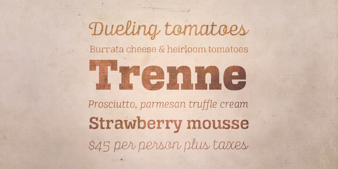
With new fonts being created each day, a web designer may be tempted to include as many as possible on their website to make it look original and interesting. The best advice that can be given for this – don’t! Your site should have no more than two fonts, as anything that goes beyond that makes the site look cluttered and unprofessional. Either go for a smart contrast, or choose two fonts which complement each other well. Also watch the colors that you use, as it has been proven that colors in fonts can affect your web visitor’s feelings and emotions.
2. Long Scrolling
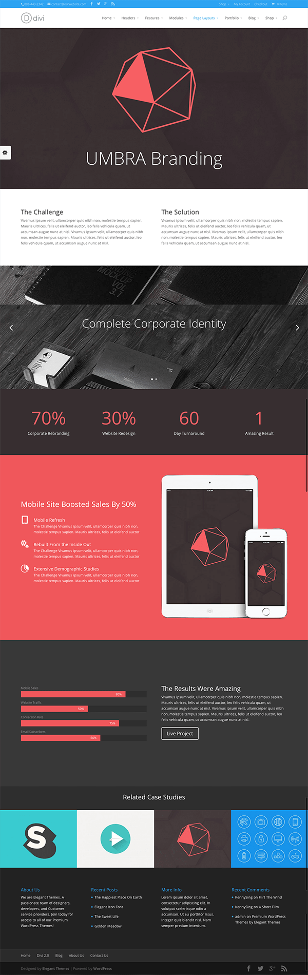
This is a trend that has been growing steadily, though in 2016, the popularity of the long scroll website may take a nose dive. This is because of misuse of this concept, such that there is now too much information to scroll through on a site. There is also the chance that the content has not been adequately divided, so the entire scrolling process becomes mentally and physically exhausting for the user.
Another disadvantage of long scrolling is the hamburger menu. Once an essential part of websites that wanted to be accessible on mobile devices, it now shows up on full websites, which makes it a challenge for the regular user to find what they need. Simplicity is diminished as users try and deal with this added complexity.
3. Parallax Websites

These have gone through a wildly popular phase in 2015, which seems to be dying off in 2016. This is because they have been misunderstood and therefore misused. The parallax website is actually an excellent idea that allows for depth to be incorporated into a website, and for the picture to change while scrolling. This works when the website has more than one page and a considerable amount of content.
The mistake that many web designers have made is trying to use this concept on a website that has a single page. This concept works best on websites which have been separated into different pages, to allow for quick scrolling. These are also at a disadvantage for being heavy, affecting the entire user experience.
4. Splash Pages and Popups
These are annoying, and more sites are getting rid of them in 2016. They are often advertisements from third parties, or a tool use to promote something on the site that is being visited. They stop a user from gaining access to the information that they want, which can easily cause the user to look for another site that has the same offerings, but no barriers to getting them. If you must use these elements in a site, they should provide some value, perhaps offering discounts or coupons as a reward for the visitor.
There is one thing that you will note about all the mentioned trends. They all happen to be great, having made a lasting impact on web design. The problem that has arisen is their misuse, as web designers who have not taken the time to understand how they work have used them in the wrong way. The result is that concepts that were once appreciated are now being shelved.
To get the most out of any design trend in 2016, the key is to prevent overuse, and go for minimalism above all else. This is due to the fact that websites need to be accessed on a host of devices, and therefore, having a complex page with too many elements could affect the way that a website loads. Remember, your end goal is to ensure you have as much interaction as possible, and it is not to frustrate your visitors.