


Facebook was originally launched in 2004 by Mark Zuckerberg.
Membership to the site was initially limited to students in Harvard. But the social network quickly expanded to include other universities and eventually to anyone aged 13 and over only a few years later. Today, Facebook boasts 1.7 billion active users and remains the most popular social platform by far.
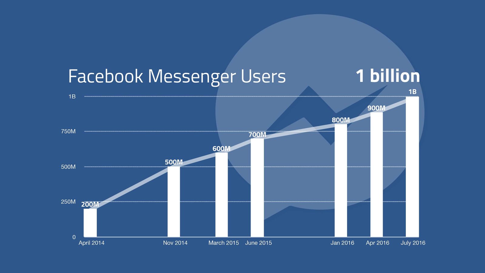
One of the biggest challenges that the company has had to face is with scaling. In other words, systems had to be built to account for the network’s massive growth over the last decade.

Why is scalability in web design important?
Because any compromises in quality (e.g. site loading times) will have a negative impact on the overall user experience. This is why planning a site that can scale as your business grows is absolutely critical.
Here we look at the different factors involved for structuring a scalable site for your business. Designing for scalability has picked up a lot of steam over the past few years and is reflected in web design trends every year. The essence of scalability boils down to three fundamental things; picking the right content management system, using a secure hosting system and responsive web design. It’s crucial to get these fundamentals right from the start. If you lack the know how of setting this up yourself, consider using a web solutions provider like PWD, if you want web design services in perth for the initial setup.
1. Content Management Systems
Managing content for a small site with only a few pages is not that difficult.

But as the amount of content grows, the challenge is efficiently managing the creation process from start to finish. It is not uncommon for an organisation to have a site that consists of hundreds of articles from different contributors. Or for a retailer to have thousands of product pages each with their own descriptions and images. Attempting to manually content on this scale is simply not practical.
A content management system (CMS) is an online application that makes it easy to manage and organise digital content. With a simple user interface, organising content is relatively straightforward even for those with little technical expertise.
Here are some key factors to consider when choosing a CMS:
- Core functionality: – Most people think that content management systems are primarily for viewing and editing content. While this is true to a certain extent, you also need to consider the core functionality of the CMS and whether it suits your business.
- Ease of use: – You want to choose a CMS that is easy for the entire organisation to use. One area to pay particular attention to is the text editor as this is where content is added and edited.
- Mobile friendly: – There is simply no way around it. You need a CMS that allows visitors to view the content on all devices including smartphones and tablets.
- SEO features: – Any CMS you choose should allow you to easily modify the on-page factors of the site. Optimising for your target keywords will help your pages rank higher in the search results.
- Scalability: – You need a CMS that is able to easily organise your content and other assets (such as images). It should also be able to maintain high performance as your site grows.
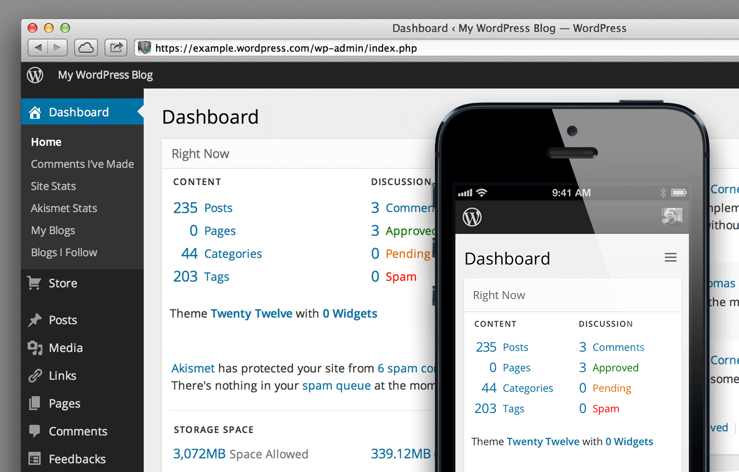
The bottom line: Your site may only consist of a few pages now. But you also want to account for future growth by implementing a CMS right from the start. WordPress is one of the most popular content management systems but there are many others including Drupal and Joomla.
2. Hosting Services
Before anyone can actually access your site, it needs to be put on a server.
The good news is that hosting solutions are relatively affordable and come with a plethora of features to get you started right away. While there are free hosting solutions available (e.g. Weebly, Blogger, WordPress.com, etc.), these are generally not recommended as you do not have complete ownership of them. They also have numerous limitations in terms of scalability.
Hosting providers typically offer a range of solutions which include:
- Shared servers: – As the name suggests, this solution means that your site is hosted on a shared server with other sites. That means that the amount of disk space and bandwidth allocated to your site is limited. Shared servers are good options for smaller sites and typically have lower costs.
- Dedicated servers: – This option means that your site resides on a dedicated server and is not shared with other sites. Dedicated hosting plans offer a greater degree of control and are able to handle more bandwidth but come at a higher cost.
Shared plans are the most affordable hosting option but they also have a number of limitations. Perhaps the biggest is the limited resources available. If your site is steadily growing, you will eventually hit a bottleneck as the limited bandwidth may not be able to handle the traffic.
This is why it is important to select a host with scalability in mind.
The bottom line: – Choose a hosting provider with care and avoid using free solutions. Dedicated servers offer far more advantages than shared servers but also cost more. Some hosting services provide tiered packages that let you easily migrate from one server to another should your site need more resources.
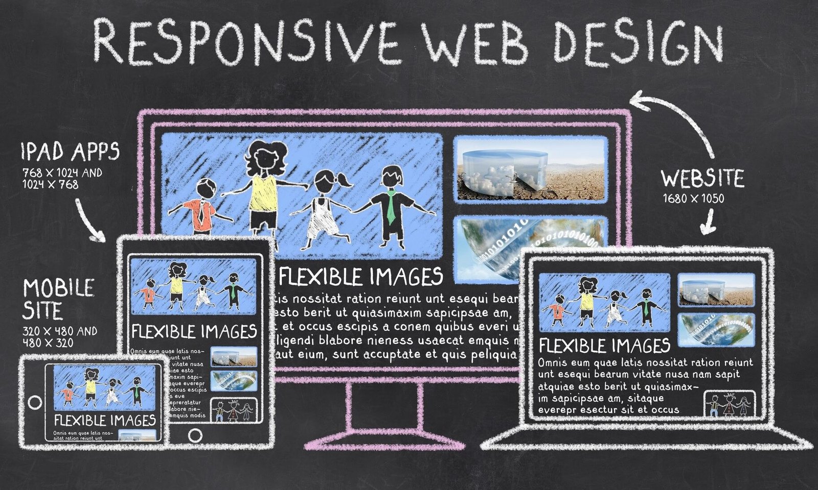
3. Responsive Design
Consumers around the world use a myriad of devices to connect online.
The introduction of the smartphone and other advancements in technology have seen explosive growth in mobile usage over the past decade. In fact, global traffic from mobile devices has now overtaken traffic from desktop devices.
Nothing is more frustrating than landing on a site that is not optimised for mobile devices. It results in a poor browsing experience and visitors will not hesitate to go back to the search results. Noticing the upwards trend in mobile usage, Google has even released a major update that makes mobile-friendliness a ranking factor. As a result any business serious about driving more sales online have followed suit.

What this means is that you cannot design a scalable site without also factoring in mobile. So design for mobile right from the start.
Google’s recommended solution for building mobile friendly sites is responsive design, a grid like structure that dynamically adjusts to fit all screen resolutions. Whether visitors land on your site from a desktop or mobile device, users are able to easily navigate the page without having to constantly pinch and zoom.
The bottom line: Choosing the right CMS and hosting provider are important decisions in terms of building a scalable site. But mobile cannot be ignored either as more consumers are connecting online and performing local searches through smartphones. Responsive design is the recommended approach to meet all mobile requirements.
Conclusion: –
It pays to lay down the foundations for a site that can scale as your business grows.
While your site may not be the next Facebook, you undoubtedly expect for it to grow in users. But first you need to take the time now to plan for a scalable website. This means choosing the right CMS and hosting plan, and designing for an increasingly mobile world.