
Data visualization is a graphical presentation of data. These techniques and tools help to interpret the data with the help of charts, diagrams, and pictures. Data visualization tools allow users to identify trends, correlations, and patterns in data.
Data visualization is crucial for Big Data. Data sets receive data from myriad disparate sources. As the amount of data continues growing exponentially, data scientists need simple ways to detect underlying patterns. Data grows at a fast pace, and scientists need to analyze it quickly. Visualizing the data in multiple devices improves collaboration and produces effective work. In addition, users in the receiving end are able to quickly interpret the information.
The problem is, conventional visualizations don’t translate well to small screens. The screen size makes it difficult to see the entire visualization. Sometimes this causes missing important information. Using responsive design helps data scientists make the visualizations of their data more available. In this article, we will explain the basics of responsive web design and how it can help improve data visualization.
What Is Responsive Web Design?
Responsive design is a web design approach that aims to optimize websites for viewing and navigation on multiple devices. Consumers nowadays don’t have the patience to deal with a website not optimized for mobile. According to Google’s mobile playbook, 40% of users will turn to a competitor if a website is not responsive.

The main principle behind responsive design is that the content should adapt to the screen dimensions and the navigation style. However, there is a difference between adaptive (mobile-friendly) and responsive design.
A mobile-friendly or adaptive design website will fit all the webpage on the screen. It usually features a different size designed for each device. As a consequence, the user sometimes has to zoom in or squint to find what they are looking for.
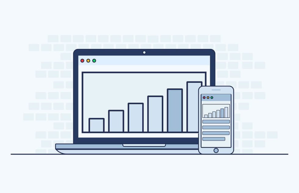
Responsive design adjusts the entire design to the target screen, highlighting the most useful parts. It adjusts to the pixel-width of the target screen, maintaining the user experience on every device displayed. You can see an example in the image below.

This image shows a critical aspect of responsive web design. The images need to be responsive too. When the website layout adjusts to the new screen, the pictures must also adjust.
Responsive design involves more than resizing. The quality and resolution of the image should adapt too. Designers need to use proper image optimization to ensure the images translate well and load quickly. Fortunately, manually optimizing images is a thing of the past. There are several user-friendly image optimization solutions that automate the process of responsive images. There are several resources online that can help you learn how to work with responsive images.
Responsive Design and Data Visualization
The responsive design needs to be applied to every image, diagram, or content that needs to be viewed on multiple devices. This is why application developers have adopted responsive design principles. Technologies such as JavaScript allows developers to adapt an app visualization to the size of the target device.
Adapting the visualization to the screen size is only a first step. Adapting the presentation of the data to the device screen is another issue. Users need to be able to quickly understand the information presented.
For example, when you try to display a web visualization on a mobile device, there are often problems with visualization and functionality.
Here’s an example of a Nobel Prizes statistic visualization:


If you try to display this map on a mobile site without optimization you probably won’t see many of the countries without zooming in. The visualization must be clear to the mobile or tablet user from the first look. Detailed or interactive tools can work better on desktop or laptop versions.
Gone are the days when scientists needed to rely on a static chart of a graph to convey information online. Scalable vector graphics display interactive data visualizations, adapting them to smaller screens such as mobile and tablet devices.
Tools such as D3.js, Bootstrap or Viewbox for Scalable Vector Graphics, can help you create visualization graphics that are clear and understandable for the user. Other techniques such as AJAX help developers create dynamic pages that update in real-time without reloading.
Nowadays, most responsive design involves designing mobile-first. That means designing apps and websites for the limited screen size and bandwidth of mobile users and scaling up from there. The same principle applies to data visualization, by using what is called an API-first model. An API-first approach helps users organize the raw data using an API to generate an output in the desired format. The user then can build a visual representation with HTML code.
5 Data Visualization Tips for the Web
Here are some tips that can help you improve data visualization models when applying them for web or mobile:
- Have a specific audience in mind—when designing the visualizations. .Visualizations for beginners should be clear, structured, and engaging. Visualizations for experts can be more detailed, allowing readers to do their own take on the data.
- Don’t rely exclusively on interactivity for exploration—users don’t like to click on interactivity buttons of mobile websites, according to the NY Times. .You should use interactivity as a way to include additional data for users wanting to more. The main data should be openly on display.
- Use visual salience to guide the visualization—the term visual salience refers to the quality of an image or item to grab the attention of the viewer. This is especially useful on mobile and tablet versions, as it makes a visual element stand out, focusing the attention on the key data.
- Use visual hierarchy—you can tell a story by highlighting trends and correlations in a clear visual hierarchy. Incorporating the legends into the chart can guide the user through the data. .
- Design mobile-first—to avoid losing details in the data visualization. You should design first for mobile and tablet users and then scale up for desktop. This will ensure everyone gets to see the correct information, no matter the device they use for viewing.
Wrap Up
Responsive web design is changing the way users interact with websites and web apps. Big data visualizations are becoming more popular as they showcase the most relevant information. This helps users to extract useful information from otherwise huge datasets.
On the other hand, the widespread usage of mobile devices requires optimizing the visualizations to their format. You can apply responsive design tools to convey a clearer message with your visualization. Users can quickly understand the data, regardless of the device. This, in turn, improves the user experience. You can use the tips presented in this article to build effective and clear data visualizations.