
jQuery mobile is a framework that is used to design web applications, mobile applications and mobile websites. The framework works on all the popular tablets and smart phones, and aims to provide users with an interface that is unified across all mobile platforms. With so many web developers focusing on mobile web development, it is important to know some of the tips that will make it easier for you to design websites that your users will be anxious to visit:
1. Setting the background color of a page
You can always change the background color of a page without necessarily having to write it repeatedly in the jQuery mobile CSS. This is a little tricky, but a tip that will save you a lot of hassle once you start designing apps for mobile users. Normally, setting up the background color to the body element would work, but now that you are using the jQuery mobile framework, you can link it to the ui-page class.
2. How to disable loading pop-up messages
Majority of users find loading pop-up messages very annoying, especially if they show up every time you try to load a page. To enjoy a flawless mobile browsing experience, you have to disable such messages. To do this, add the following code into your JS file, $.mobile.pageloading(true); and you will not have to deal with loading popups ever again while you are using the internet.
3. Using media queries to target devices

If you want to target devices in CSS based on the size of their screens, you can always use media queries. With this, you can come up with a two column layout for tablets and a single column layout for smart phones. However, you must first have a couple of media queries in place in order to achieve this, then you can make the CSS target different screen sizes quickly and effectively.
4. ‘Cancel’ and ‘Save’ button Combo

One of the things that web developers look forward to when designing mobile apps is a library that will designs apps with two buttons next to each other. Something else that developers are always looking for is a library that is able to place two sets of buttons with different themes together. These are some of the issues that jQuery addresses, because there is no documentation that web developers can always keep close that will enable them to achieve these needs fast and effectively.
5. How to remove an arrow from a list item
When using jQuery, you should expect it to automatically add an arrow to every list item you create. If this is not something that you would like, you can disable the feature by setting the data-icon feature to ‘false’ on the list items which do not need an arrow.
6. Adding traditional jQuery calls
Web developers can amend items on the web page before a mobile plug-in has been activated. In order to achieve this, you can put a traditional jQuery call before the call that triggers the loading of the mobile plug-in. With this, your jQuery commands will have a chance to run before the library begins loading.
7. Adding driving directions to a jQuery mobile site
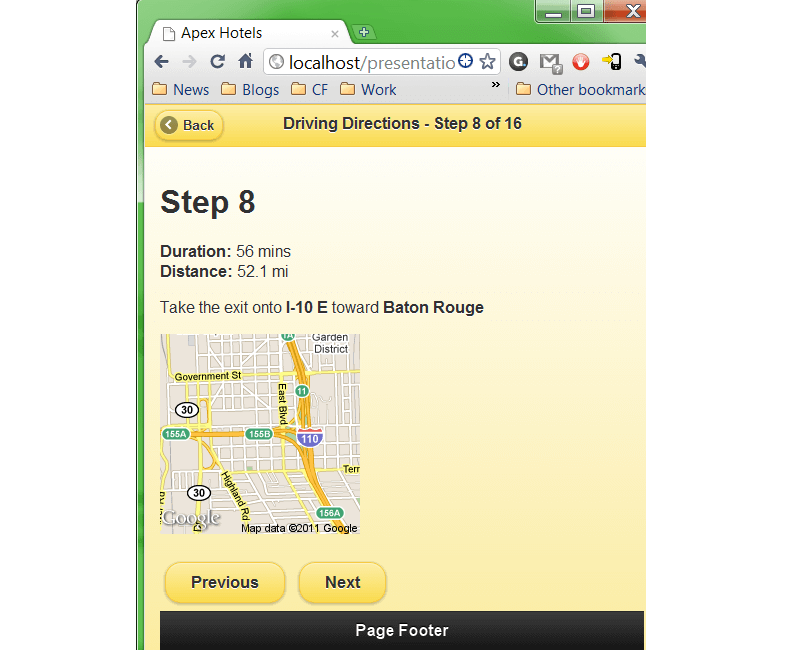
Driving directions are probably the most important feature one can have on a mobile website. That is why it is important for web developers to learn how to add such features on their jQuery mobile websites.
8. Creating popup dialogs
The library comes with great in-built features, one of which is its pop-up dialog box. However, you have to set up this feature in order to enjoy using it. However, you must remember that to do this you will have to open an external jQuery mobile page first, preferably one that is completely different from the page that you are modifying.
9. How to stop some key items from being truncated

One of the best features in jQuery is that it can abbreviate long items intelligently in order to fit them into UI elements. However, despite the fact that this is a great feature, there are times that you may not want to use this feature. For instance, if you would prefer to use full text, or if you would like to add footers to your web page, abbreviating words will be unnecessary.
10. How to create a column structure on your own

If you want to structure a single page in such a way that can be easily read from different devices, you can achieve this through a technique called “columns” in any order. However, there is always a shortcut you can take, and many web developers are taking these shortcuts in order to make their work easy. Try moving columns around through the combination of this technique and a few media queries and you will have no problem achieving good results with minimal hassle.
11. Adding jQuery mobile inline buttons

If you want a button that does not take up the width of the entire screen, you can add the data-inline ‘true’ attribute to it.
12. How to target platforms with jQuery
Many web developers focus on different mobile devices whenever they are designing for mobile. However, as much as this can be a good thing, considering that different people use different types of mobile device these days there may be a need to target one type of platform for a design you are creating. Here is an example of a code that you can use, in order to allow some parts of the jQuery to run, depending on the platform you are designing for.
1. jQuery(document).ready(function($){
2. var deviceAgent = navigator.userAgent.toLowerCase();
3. var agentID = deviceAgent.match(/(iphone|ipod|ipad)/);
4. if (agentID) {
5.
6. // do something special
7.
8. }
With jQuery, it is very easy to develop fantastic mobile websites that mobile users will find both useful and interesting. Applying some of these tips will go a long way in helping any web developer create the perfect website for mobile devices easily.