
Mobile web design is a coined term, yet fully grasping the ins and outs of building a functional mobile website and/or application is not something that comes that easily, and in most cases — trial and error experience is necessary to understand what works the best in specific situations. While it’s easy to understand that mobile requires a different set of rules and concepts to be put in place in order to function well on ALL mobile devices, it’s a completely different story when it comes to understanding the fundamentals of what makes mobile web design work.
Google has not been shy about mobile design, and earlier this year we saw an updated to the search engines algorithm, dubbed Mobilegeddon. This update brings forth the necessary ruleset for sites that haven’t yet been updated with mobile web designs, and those who have — can enjoy much higher rankings, and more search engine visibility. It’s a very logical thing to do, given that mobile is quickly become the way to do search, and Google wouldn’t want to be falling back on things like serving mobile-friendly content.
Apart from being patriots in mobile web evolution, Google is constantly pushing the limits of ways that mobile content can be served, most recently introducing Accelerated Mobile Pages (AMP).
For many, reading on the mobile web is a slow, clunky and frustrating experience – but it doesn’t have to be that way. The Accelerated Mobile Pages (AMP) Project is an open source initiative that embodies the vision that publishers can create mobile optimized content once and have it load instantly everywhere.
You can read more about AMP on the official website. Having said all that, lets take a look at some crucial tips and ways that we can optimize our mobile web designs and apps to better reflect the industry standard.
1. Build for screens
With more than 24,000 different Android devices on the market right now, building for each device individually is going to a hideous task, and frankly impossible. Each month we see a release of a new device, whether in the form of a tablet or a smartphone, and tailoring the mobile experience to each device individually can take up a lot of our time.

The best solution is to focus on building mobile website designs that adapt to most popular screen sizes, and dig deeper into understand the screen sizes of devices that fall below the 1% usage limit.
2. Mobile is becoming desktop
In the first few years of mobile device development, design was usually aimed at helping our mobile users to perform individual tasks; browsing, verifying, submitting. These days, mobile devices are capable of carrying out tasks in the same way a desktop computer would. Although it’s still important to consider the context in which a mobile website is being used, staying up to date with the latest developments is crucial towards creating a pleasant mobile browsing experience. eCommerce shopping, form submissions, dynamic actions and so much more is already readily available to mobile devices.
3. Avoid separating your mobile site

Content management systems such as WordPress have evolved to a level where all new themes are fully equipped with responsive design functionality, which in turn saves webmasters a lot of time for having to create a separate mobile website, one that would look different from the actual desktop version. The goal is to try and keep your desktop and mobile versions of the site/app to be as equally friendly, and because of the huge development in mobile web development at large — creating both desktop and mobile versions simultaneously is very possible.
This also applies to concepts such as content. Far too many mobile websites and apps offer the option to ‘switch back’ to the original desktop version of the site to experience the content fully. This can create confusion, and in many cases — drive people away from your site without having them ever indulge in the full content experience. Rather than limiting features, think of ways how you can outline those features to make them more visible to mobile users.
4. Tap into analytics
All of the above can sound quite overwhelming at first, especially when you consider that there literally are tens of thousands of mobile devices, and at any given time, hundreds of time might be accessing our website/app on daily basis — ensuring that the content we serve works on all devices equally well is crucial part of perfecting mobile web design.
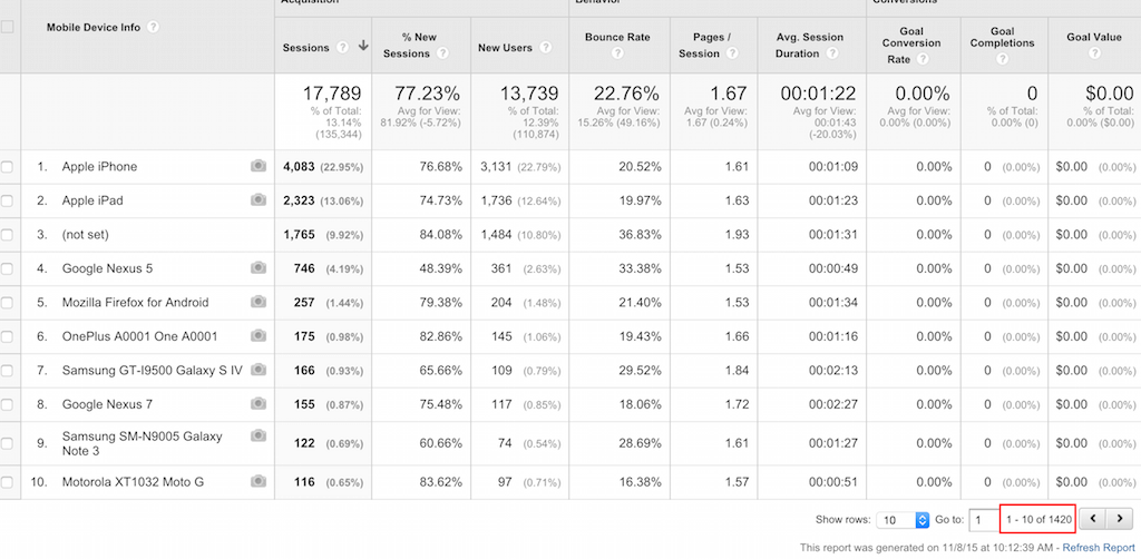
Google Analytics is the leading analytics platform that majority of webmasters use today, it’s also one of the best analytics platforms when it comes to understanding the type of devices that are using your website, and as can be seen in the snapshot above — thousands of individual devices might be accessing your site, with only a handful yielding to the highest number of visits. Just because there are only a hundred visits from a Motorola type of device, does not mean we should ignore those hundred visitors — they might actually the type of visitors who are ready to invest in our ideas and products.
5. Learn more about UI and UX
User Experience (UX) and User Interface (UI) are two crucial components of making a well-designed and well-optimized website/application that follows the latest standards. New additions to the design sphere, such as Google Material Design, are setting the bar for future designs, and it’s a good idea to keep up to date about the latest developments in such areas. Bootstrap is of course, the safe choice, but so are many other frameworks, and quite often — a lot can be accomplished with native programming anyway. If you are new to the concept of a good User Interface, a website called GoodUI is a great place to start.
Perfecting Your Mobile Website Designs
Taking it all in, it might seem like quite a lot of stuff to understand and incorporate all at once, but everyone knows that mobile is all about lightweight features, and fast loading speeds to get from point A to point B as quickly as possible. Easy to see menu bars, friendly search features, ability to customize font size and style are all part of good mobile web design, but so is the ability to integrate dynamic and state of the art features without making it seem like we’re using something that hasn’t been perfected before put in production mode.