Colors are a lesser known but a very powerful way through which one can invoke emotions. One only needs to look around in order to feel how significant colors are. Every color brings out a different kind of emotional response, which is unique from one viewer to the other. Web designers need not be experts in colors but they must have a little understanding of color usage and how important it is to web designs. A wise web designer will know how each color will affect their design in order to pick out his colors wisely. It is important to learn how to use color and contrast well in order to make strong first impressions on all your users.
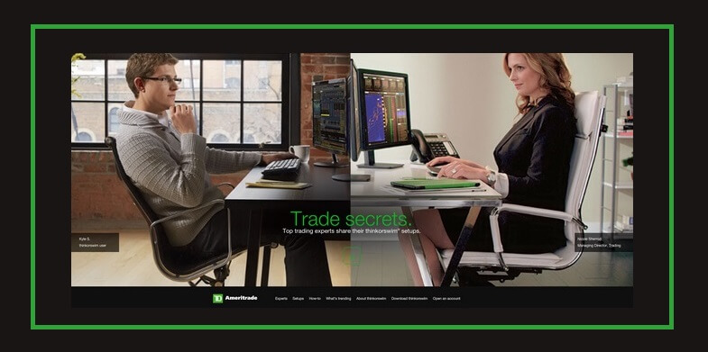
1. Black
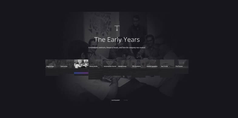
Black is the strongest of all the neutral colors and it is used in almost all websites. Its significance depends on the supporting colors. If used in excess, it can dominate all the other colors in order to promote power, sophistication and edginess. Many website designers use black as their first color of choice in order to bring out an instant feeling of sophistication and timelessness. If paired with white, you get the feeling of elegance.
2. Red

Red is a youthful color and it promotes power and importance. It is the most stunning and stimulating color you can use for your website designs. It is also very energizing. It represents strength and passion, and is the color that will attract much attention. This is the reason why it is used mainly for warnings and important notices. If you are designing a website that is calling for attention, this is the color you should be thinking about.
3. White
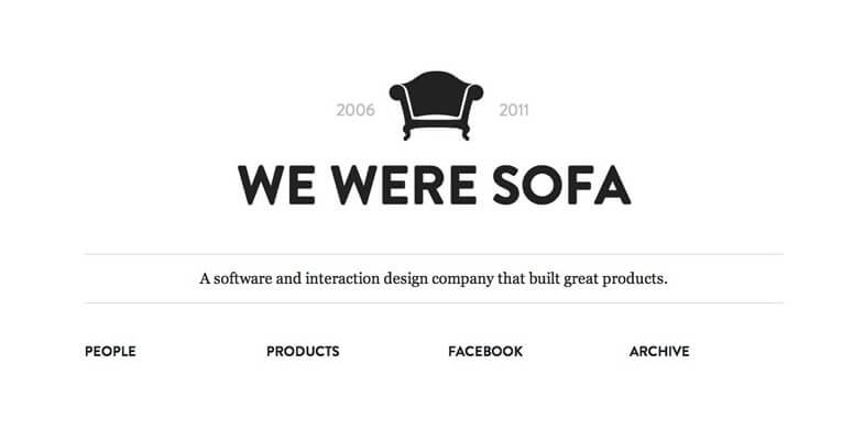
White is a very clean color. It can be used to promote simplicity, cleanliness and virtue. It is mostly associated with purity and innocence. Those websites believed to be minimal and simple use white in their background. White can be used in order to add some value to other colors on the web page as it draws less attention.
4. Orange
This is a very unique color. It can be used to promote friendliness and a show of energy. It is the color to use if you want to create a sensation of energy and movement. It is one of the warm colors that is most muted, and it is uniquely versatile. If used as the primary color, it can be energizing and quite engaging. It can also be used as the secondary color, retaining these properties but in an unobtrusive way. Any cartoonish website will work perfectly with this color, as a show of creativity.
5. Gray
Gray is one of the most neutral colors you can use on your website designs. It is a very popular color in many websites. It can be used on both traditional and professional websites as a way to promote formality, neutrality and melancholy. Its different shades are its greatest advantage because you can change the shade in order to get a customized mix of properties that range between black and white. Gray can be paired with other colors to bring out the feeling you want on your website.
6. Yellow
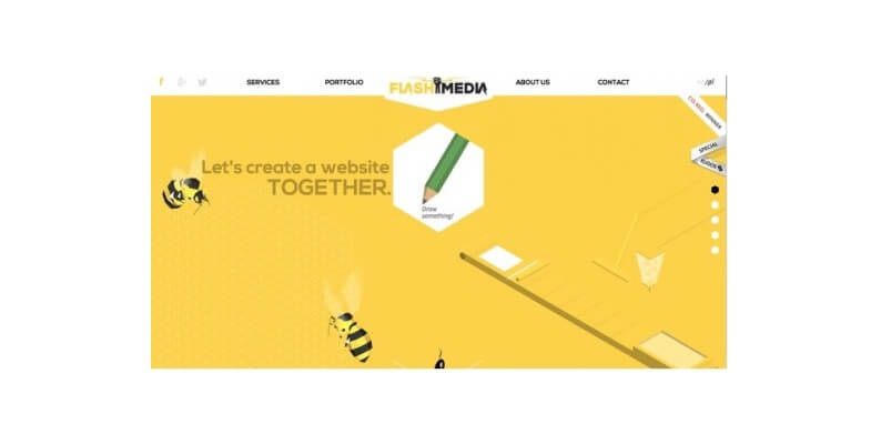
This is the color that promotes happiness and enthusiasm. It is a very versatile color but this depends on the shade of yellow that you are using. Bright yellow is the shade that is most energetic. The middle shades will give you a feeling of comfort. The darker shades on the other hand can give you a feeling of relic. They bring out wisdom, curiosity and timelessness, including gold.
7. Green
Green is the color to use in environmental and financial themes. It promotes stability and growth. Even though it is a cool color, it can be used to bridge the gap between warm and cool colors. It is as relaxing as the blue color but also as energizing as the yellow color, therefore it is the best to use in order to balance and stabilize the atmosphere. The darker shadows of green bring out the feelings of affluence and money.
8. Purple
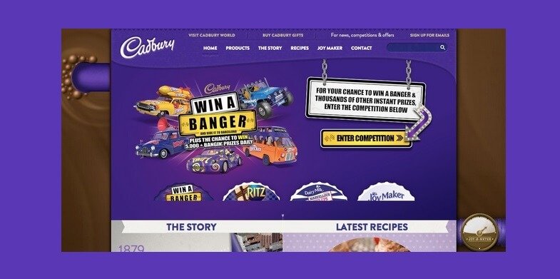
Purple is a very luxurious color. It promotes luxury and romance in its lighter shade and mystery in its darker shades. For a very long time, purple has been associated with royalty and the luxury that comes with it. It can be used to show lavishness and wealth, therefore it is the best choice to use for websites that promote fashion and luxurious commodities.
9. Blue
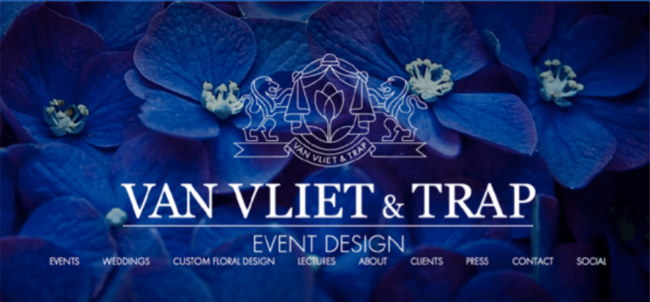
Blue is the color that promotes calmness, openness and safety in its lighter shades and reliability in its darker shades. Its meaning varies so much depending on the shade you are about to use. Generally, the blue color can be used to promote safety and calmness but its lighter shades are friendlier when the darker ones seem a bit serious. Social sites that use blue prefer the lighter and medium shades while corporate websites use the darker shades to show reliability and strength.
10. Ivory
Ivory can be used in a website design to promote elegance, simplicity as well as comfort. It is also a slight variation on white, together with cream. It is however warmer than white, which makes it more comforting and at the same time bringing out its complimentary and minimalistic aspects. It can be used in place of white in order to soften the contrast between it and the darker color, if you are using any.
Color is everything in web designing. The way your website will look like is largely determined by the type of color that you will use. Your choice of colors must match with the theme of your website, in order to communicate first hand to your users even before they go through the content to understand what the website is all about. Use colors that are attractive, those that can elicit curiosity and those that are engaging and you will enjoy more conversions in the end.