If you assume, sticking to a rigid logo design will always make you succeed. It’s a wrong belief.
Yes, picking a modern and compatible logo is an achievement today, but it will no longer preserve the audience’s attention.
It’s a bitter truth; People get bored by looking at the same conventional designs.
If you want to upraise your brand image, you need to go for a versatile logo design to make possible changes in the future (if required).
Do you wish you knew how to shape your brand image that truly resonates your audience’s interest?
Discover five vital factors within this article that you need to practice to get an optimal and futuristic logo design for your brand. It will last long with the adaptability to mold whenever required.
OR…
You can further get an instant custom logo design from a skillful graphic design agency Logo Orbit that is well-grounded in providing branding services.
Let us dive in.
Design Visibility
No matter how perfect your logo is if it doesn’t encourage visibility, it won’t benefit you with profits.
Suppose…
It’s a tiring evening, and you’re returning home from work, you see a sparkling yellow symbol and get an alarm of hunger. You turned the indicators on and head towards drive-through. That’s how Mc Donald inspired you to recognize your need just by viewing at the logo for once and take further action.
Even it’s not a unique kind of logo but still caught your eyes. They truly knew to identify what people react to.
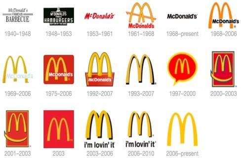
The visual image shows the similarity between logos that reformed timely to enhance brand visibility.
A mixture of multiple graphic ingredients might get your target audience in a confused state to identify the brand.
It is recommended to keep the logo visible enough and easy to recognize. However, it’s not a 19th century where you need to pick an unusual design to impress people.
Responsiveness
“In order to be effective, be responsive. In order to be responsive, listen.” ― Sharon Weil
Logos are used at more than one place, including website, business cards, letterhead, images, videos, billboards, and other related mediums that require separate dimensions.
A responsive brand image involves flexibility to alter it accordingly. The graphics should not get unsettled while positioning anywhere.
It’s your choice whether to create a number of versions to fit into different spots or a simplified one that is identical to any size or background.
Designing multiple variants of a logo that differs with one another in terms of colors and typography, tends to improve the likelihood of disloyalty among people.
Make sure to link each logo collectively. Every version should resemble with rest of the family and remain logical with the original one.
Do not force to simplicity if it’s getting awkward. Alternate it with an abstract symbol and use consistent shape & colors to ensure responsiveness of the brand image.
Color selection
“Color is a power which directly influences the soul.” ― Wassily Kandinsky
Knowing the fact that right color selection promotes brand recognition.
A logo must be according to your niche’s interest. It requires an in-depth study on culture, age, demographics, and their sentiments.
You need to be cautious while choosing a color palette it requires to be impactful. It can make or break your business since it drives emotion among your targeted audience.
It is not mandatory to stay on one color, make possible variations, and play with color psychology (influence on human behavior).
While it needs to be balanced enough to fit any background without losing its perception. As you know, it will appear in different areas, and printed as well to various sources such as newspapers, promotional banners, etc.
Knowing the color trends can direct you to refine your brand color preferences, as balanced contrasts express various moods of design and key to establish the brand identity.
Format
A single logo cannot be mold to every platform.
It is highly recommended to create multiple variations if required to scale on different areas. Standard and Stacked formats are two basic design layouts that should be enough if you’re at a new startup.
The standard one (horizontal shaped) is the original one that can be used anywhere from websites to banners.
Whereas, the stacked version (Vertical shaped) focuses on the sign more than typography. Due to squared dimensions, you can use them as a recognition mark to your social profiles as well.
Having diverse layouts of a logo is essential as your business will expand gradually; it needs to appear in more areas with separate arrangements.
However, it needs to be accurate from the beginning as you won’t be able to focus it later on since you start working on something else.
Simplicity
“Truth is ever to be found in simplicity, and not in the multiplicity and confusion of things.” ― Isaac Newton
Simple design does not refer to ordinary art. But forming such a piece of art that the public understands.
Big giants out there have a simple and ideal brand image which anyone can see and identify the context it refers to.
All you need is to communicate the audience, assuring trust in your brand. Once they understand the logo and what you’re trying to convey, wins their emotions.
However, complex logos leave confusion among your target audience that eventually make them lose their confidence.
Meanwhile, the above image shows that logos are being simplified periodically to make a visible and clear impact on visitors.
The simple design requires fewer efforts and stays with your company for a long time.
Wrapping Up
Logo is an integral element of your business that nearly influence everyone.
Are you paying enough attention to enhance your logo’s longevity?
Just because you created a logo that pleases you doesn’t mean it will drive the equivalent impression to your potential audience.
Determining key factors that empowers you to design long-established brand image, and retain your corporate achievement along with holding people’s intent look long enough to transfer your thoughts.
By practicing five significant factors explained above in this article, you’ll get to know what it entails to design an impactful and futuristic brand image that fascinates your audience.
Logos are the most important visual manifestation of an organization irrespective of its size big or small. Customized logo designs provide a business with many benefits: