
Hamburger menus have been in use for quite some time and for a while, they were revolutionary. They are used for full width navigation especially at smaller breakpoints. The technique was mainly used in order to optimize the space or lack of space for desktop and also mobile sizes.
For so many years, web designers have been using the hamburger menu icon and they have been getting amazing results from it. The problem is that today, this concept has been overused, so it is time for web designers to think of equally useful and amazing alternatives that will still work perfectly for responsive interfaces. Hamburger menus have amazing benefits in that they are handy, intuitive and compact. However, they are now becoming boring and alternatives that work similarly or better than them are being sought after. Here are amazing alternatives you can go for:
1. Progressively collapsing navigations

This type of navigation makes use of all the best features of the hamburger menu, which are mobile friendly, toggle-able and also its ability to work with off-canvas navigation drawers. The navigation is great and forms a better alternative to hamburger menus in that it makes better utilization of space, it prioritizes visible items and also it keeps the optimal desktop view for as long as it can. With this navigation, you get to see prioritized list of pages on larger devices, for instance the pages for sports, weather, news, TV, Radio, iPlayer and many more.
These are presented in a drop down menu, together with other important pages being listed in the order to importance. As the site continues to scale down, the navigation starts to remove the less important pages from the main navigation bar, adding them to the drop down. In the end, you are left with a smaller list of pages, which has been highly prioritized. This type of navigation can be styled in different ways; therefore you are not limited to off-canvas or use of kebab menu icons.
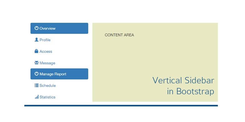
2. The ultra-narrow slide-out menu

This one represents the return of sidebars. The good thing about it is that it is not too much, rather it is minimalistic and classic. With this new design, the menus are slicker, more compact, thinner and also more elegant than the sidebars of before. What you get with this concept is an ultra-narrow column that includes so many elements, for instance logotype, the menu icon, social icon (depending on the preference of the artist), a link to the portfolio or even a standard icon that is based on the pagination of the hero slider. This kind of menu will appear on the left side and it will be seamlessly integrated into the design. What happens is that it will slide out simply so as to reveal all the elements that have been hidden, like in mobile apps to allow the user to see what is available with ease.
3. Scrollable navigations
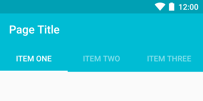
This is also an excellent alternative to hamburger menus. For sometime now, horizontal scrolling in web designing has been considered as a great blunder but with the current guidelines on material designing, scrollable tabs have been introduced and opinions pertaining to scrollable menus have changed considerably. The scrollable menus that people do not like are those with unattractive or cluttered scrollbars, which is not what we see in horizontal scrolling these days. What we see these days are self hiding transparent bars, which do not affect designs in any way. Today, horizontal scrolling is now a common way of navigating on indigenous mobile apps. Larger sites using scrollable navigations show navigation items that are specific to every page in a website, and at the same time makes it easier to find other sections of the site.
4. Navigation with vertical lettering
This is one of the newest trends in web designing today. It is fresh, natural and it stands out from the horizontal navigation that has been in use for some time now. Good thing about navigation with vertical lettering is that it takes less space as it utilizes just a narrow line. It is also visually weighty as it stretches out almost to the top of the screen. This is the best technique to use in modern designs as it is compact, very informative and also zingy.
5. Menu scattered around the perimeter of the screen
This kind of navigation is not really common because it requires a perfect environment for instance a layout that is centralized with detectable gutters around the structure. However, it is a great way to give some taste to your navigation. From a glance, you might think that this idea is only good for smaller website designs but this is not the case; it can be used even for larger designs with more than four inner directories even if it only has four corners. It can have more corners, with each corner representing a certain page with different information. This is the right concept if you want to prioritize some information, yet you want to keep everything accessible, neat and very simple.
The menu is a very important element of web designing and it can enrich the general look of your website design, adding some nice elements to the entire structure and also improving the way the design looks as well as the experience of the user. It therefore has to done well in order to stand out, so as to bring out the design where it has been used. Small details can add so much to a web design, which is why the kind of menu that you use means a lot. Hamburger menus have been working very well for many designers but since they are being overused today, it is time to look at some of the amazing alternatives available. Good thing is that there are many alternatives to hamburger menus that you can choose to use in order to impress your visitors and also to make it easy for them to get what they are looking for.