![]()
When somebody mentions a famous brand to you, does your mind easily find its logo that is stored in your memory? If your answer is yes, then we are speaking about an effective logo design that makes the picture memorable. If you own a business, you certainly want your clients to remember your company’s image without any difficulties. So, what are the fundamental principles of creating an effective and reliable face for your company?
Firstly, you should remember that logos are symbols and they should directly tell your customers what your company does. It is necessary to think about the distinctive features that you want your clients to remember and choose the most important ones. Your logo will be compared to the ones of your competitors, that is why it is essential to understand what makes your company unique and what your customers need to remember. It is vital to think about your target audience, too, because your logo should appeal to your prospective clients. There is no doubt that young women fond of DIY projects will not be attracted by the same logo as middle-aged men keen on fishing. So, you should keep in mind what message your logo needs to transmit and who has to be affected by it. For example, if you are involved in medical business and you are sketching a logo for a medical company, you should consider your rivals’ logos and clearly indicate with the help of your logo what kind of medical services your company provides, who will be your visitors and what your company’s policy is. You can take a look at various medical WordPress themes created for medical companies and compare their logos.
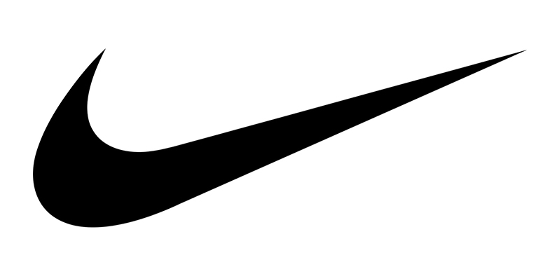
Secondly, try to make your logo as simple as possible. It is better to avoid unnecessary elements that do not add to the general information about your company and its principles. You do not want the image of your brand look crammed, do you? The logo will be memorable if a person can recall it and describe its main elements after one glance. In other words, a logo that contains too many elements will be removed by the memory very soon. One of the best examples of simplicity is Nike’s logo. People all over the world easily recognize this company, although the logo does not contain any specific images or letters.
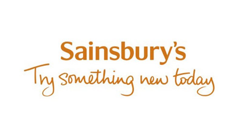
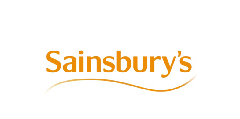
Moreover, your logo has to be modern but timeless. It should follow trends and fashion of the modern world, but at the same time you have to think of elements that will be appropriate in 10, 20 and more years’ time. Your intended audience should easily associate your logo with your company during a long period of time. To illustrate the stability of logos, we can mention automobiles’ logos that have remained the same for many years. Logos of brands as Audi, BMW, Honda, Hyundai, Mazda, Mercedes-Benz, Mitsubishi, Subaru, Toyota, and many others, are recognizable in various countries. You may redesign your logo with time, but it is better to keep the style and the key concept of your business. It is easy to notice on the pictures below that Sainbury’s company has preserved its colors and style.
Thirdly, your logo should be proportional and well-balanced. It will appear in various contexts, both on the Internet and in real life, so it should look remarkable in any size, either on a little pen or on a large banner, in any position, either horizontally or vertically. Numerous companies use specific typeface without any images on their logos. A good idea is to develop an unusual composition of letters that stand for your company’s name, keeping in mind that the typeface and the combination of letters should be distinctive. You may remember the logos of such companies for children as Carter’s or OshKoshB’Gosh that are notable for their original typeface.
![]()
![]()
Another way to develop a logo is by avoiding letters and designing an impressive and catchy image. Shapes and lines that are used in a logo should be of profound importance, too. Remember that using symmetry always creates aesthetic satisfaction. As an example, have a look at the logo of TemplateMonster, which is carefully crafted to achieve symmetry both horizontally and vertically. Pay attention to the grid which emphasizes the logo’s curves and angle that create the shape.
![]()
A popular type of logo is the one which includes both letters and images. While pictures are used to draw viewers’ attention, letters serve to convey the company’s message. Different typefaces may change the style of the logo and create the customers’ mood. Indeed, lively and bright logos of companies for children that you can see below establish a joyful mood.
![]()
![]()
![]()
The color palette used for the logo design deserves scrupulous attention as well. The color scheme can highlight certain elements, especially when contrasting colors are used. A world-famous example of a logo with contrasting colors is the symbol of Billa stores.
![]()
It cannot be denied that colors influence our mood, so color choice should be a conscientious and painstaking task. Colors that are too bright or are not connected with your company’s message can distract your clients’ attention. A popular color in logos is blue, as it is calm and can be combined with other colors easily. You might recollect various companies that opted for the blue color.
![]()
Black-and-white logos, such as Chanel’s one, can look distinctive as well, though they do not include any bright colors.
![]()
To conclude, designing a company’s logo is a tremendous undertaking. You should remember that your logo has to be simple, but modern and timeless at the same time. Its typeface and images should keep your target audience’s attention quickly while being proportional and well-balanced in order to reflect your company’s message and attitude.