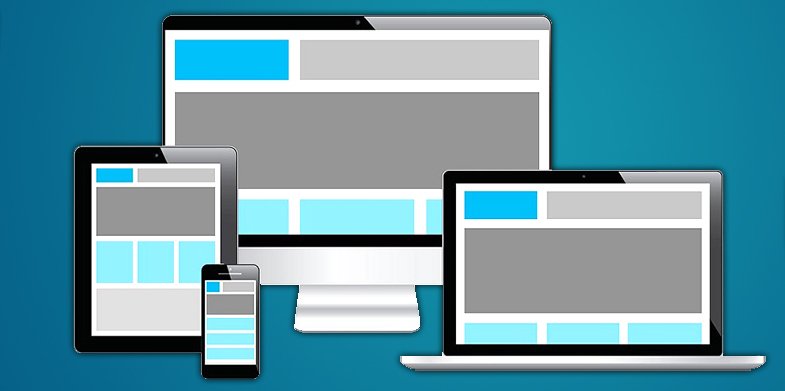
Online technologies do not remain static. They require constant developing to provide for the growing needs of users, who cannot imagine their everyday life without mobile devices. Have you ever noticed how many people around you use their tablets, smartphones and other gadgets on the go to solve their personal or business problems? This is convenient, time-saving and effective. So, if you are about to launch your own website, responsive design should definitely be a priority to you.
Responsive design helps make your website mobile-friendly. This means that users will be able to access it whenever they want and whatever they do, irrespective of a mobile device and its characteristics. As a result, your website traffic increases, the amount of your sales (if any) grows, you start generating profit and attracting new leads. Isn’t that your major goal? To find out some of the main benefits of responsive design, consider the facts mentioned below.
Responsive Design and Its Advantages
• Flexibility: – Regardless of the mobile device you are using, you won’t face problems when browsing through the content. It is adjusted to the screen type and resolution, making it simpler for you to read. This concerns both the images and the text. All website elements retain their initial appearance without compromising with the quality and information value of the content.
• Stunning User Experience: – Responsive design always ensures stunning user experience and are accessible 24/7, while discoverability of the required content contributes to the ease of search and convenience. It doesn’t matter a lot what type of device you are planning to use – responsive design ensures 100% satisfaction and amazing web browsing experience.
• Cost Efficiency: – It’s smart to make your website mobile responsive if you aim at effective development of your business and traffic generation. There is no longer the need to create two separate websites, one of which will be accessible on the web and another one will be available on a desktop computer only. This is just a waste of your money, time and effort. Instead, you can make use of building a responsive website that will adjust to any mobile device as well as to your computer. What’s the sense in investing into two projects, if you can create a functional responsive website?
• Increased Conversion Rates: – It’s no wonder that modern users give preference to responsive mobile websites over their desktop alternatives. You can make use of this feature to convert new clients by offering them simple web browsing options, irrespective of the device they use. A website that looks visually appealing and features advanced functionality cannot be left unnoticed and can certainly make your business stand out from the crowd by beating the competitors.
• SEO Benefits: – When it comes to search engine optimization, responsive web design is considered as crucial as the content quality. Having a single website makes it possible to avoid undesirable content duplication, which can have a negative effect on your website search engine ranking. Additionally, you will be able to create more effective backlinks, improving your website positions.
These are only a few benefits of making your website mobile responsive. If you have realized the importance of this step and are looking to get the one of your own, you can choose between several options. It’s possible to hire a specialist, who will do that for you, for example. This, however, is not the best solution because of the high cost of professional web building services. A far better alternative is to use website builders that make it possible to create stunning, functional and professionally looking websites with no hassle at all. Let’s have a look at some services that will help you cope with this challenging task.
Top Website Builders to Design Responsive Websites
1. SITE123
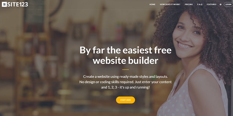
SITE123 is a popular WYSIWYG website builder, the functionality of which often exceeds the initial expectations of users. The service ensures great web building experience due to the extensive selection of website customization tools. The system has recently introduced the advanced multi-language tool, which is a great addition to any responsive website.
It’s quite easy to build responsive websites with SITE123 and even a newbie can cope with the task at ease. The system offers a nice collection of mobile responsive templates that automatically adjusts to different screen sizes and resolutions. To simplify users’ search, all the templates fall into thematic categories. Just choose the one you need and customize it to your liking by arranging the modules that come with the system. The process is simple, intuitive and convenient for everyone.
2. uKit

uKit is a website builder that is primarily used to create business websites. Realizing the importance of responsive design for effective business promotion, the developers of the system have made the templates responsive and easy to customize. The templates are subcategorized with regards to their thematic focus. A user just needs to choose the most suitable template and web customization tools to create a functional website that will provide information value.
Among the features that highlight the system uniqueness, one can mention the possibility of integrating scrolling animation effects, adjusting 404 page design and making use of the advanced eCommerce options or Ecwid plugin integration.
3. Ucraft
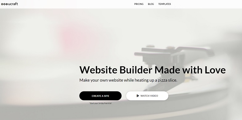
Ucraft is a cloud website builder, which comes with an extensive collection of pre-designed responsive templates. They are easy to use and customize based on the personal or business objectives of a user.
The interesting bit is that the system makes it possible to create multilingual websites by means of using a special app. A user can add as many languages as needed and start the translation on the go. Ucraft is a smart choice for web studios, which practices team work. This is because it grants mutual access of the dashboard to everyone that is engaged in project development.
4. uCoz
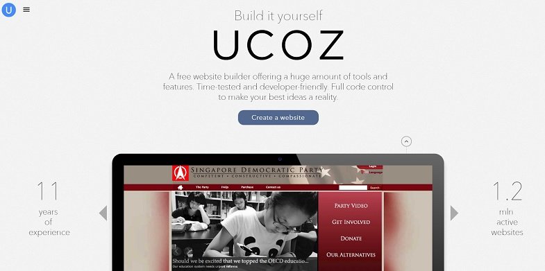
uCoz is a universal website builder that allows creating different types of websites in a limited time frame. Functionality of the system is more than enough to meet the needs of any client. The system offers versatile website customization tools.
It makes it possible to choose standard and responsive templates. The latter are paid, so, consider this feature prior to starting working with the system. If you plan to use uCoz, make sure to have coding skills to produce stunning results.
5. Mobirise
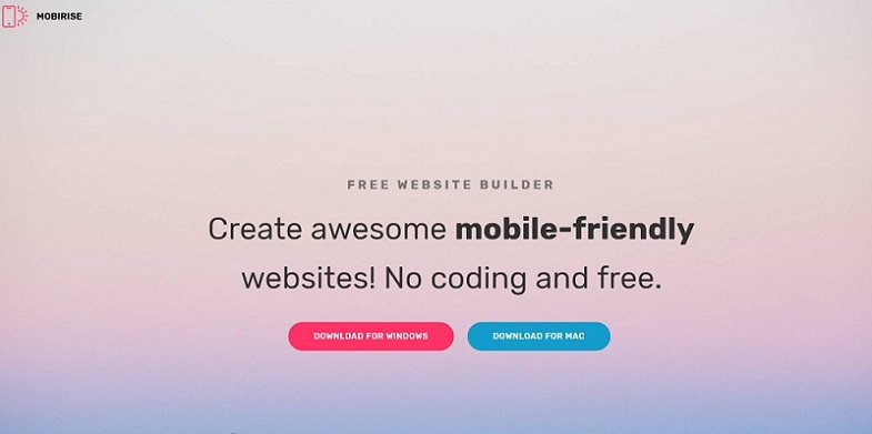
One of the most distinctive features of Mobirise is that it is not a cloud-based website builder, but the software you have to download and install prior to using it. The system is block-based and allows for the easy choice of blocks that can be arranged on a page to give it the desired look.
Mobirise comes with a set of responsive templates one can select and customize with regards to business or personal needs. It’s possible to make use of more than 400 ready made blocks, 6600 icons, over 20000 high resolution photos and Github integration options.
Bottom Line: –
Responsive design is a must-have feature for any website nowadays. It makes it possible to extend your website’s functionality, drive traffic, increase the amount of sales and reach other personal or business objectives. There are lots of web building tools that can ensure mobile responsiveness of your projects. Each of these tools, however, is oriented on specific goals and may not suite everyone.
When it comes to creating responsive sites, website builders work better than other systems. They feature the best price/quality correlation and makes it possible to achieve decent results with no waste in time, effort and money. This is exactly what you need to create simple responsive websites.