![]()
Logos are tiny, so they must be easy to make, right? Wrong! They are actually very complex designs, because they have to send a strong brand message in a small space. Whether you are designing a logo for your website or for your print marketing, there are seemingly endless ways to mess it up.
We asked a team of experienced logo designers to tell us about the ugliest logos they have seen over the years. The result? We present you with the twelve worst logo design mistakes of all time:
1. Choosing your favorite color
While many designers have natural intuition when it comes to choosing a color palette, good designers never pick a color based strictly on their personal preference. You may think turquoise is the prettiest color in the rainbow, but if it clashes with your client’s brand identity, your design isn’t doing its job.
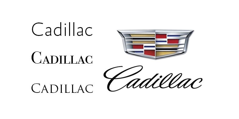
2. Misjudging typography
Like colors, typography can impact people’s thoughts and feelings. Choosing the wrong font will make the audience feel disconnected from the brand’s logo. You may love a big, bold serif, but that won’t match a luxury brand very well. Take Cadillac’s logo for instance: it wouldn’t be nearly as sophisticated if it wasn’t in cursive.
3. Skimping on shapes
Shapes can do a lot to enhance a logo—or to ruin it. When you don’t consider shapes carefully, you miss opportunities to improve the logo’s meaning. For instance, a square can balance an unstable logo, and a circle can add a sense of unity. Each shape conveys a set of abstract brand qualities that are hard to represent with other symbols; if you omit shapes from the logo, you could lose sight of those qualities.
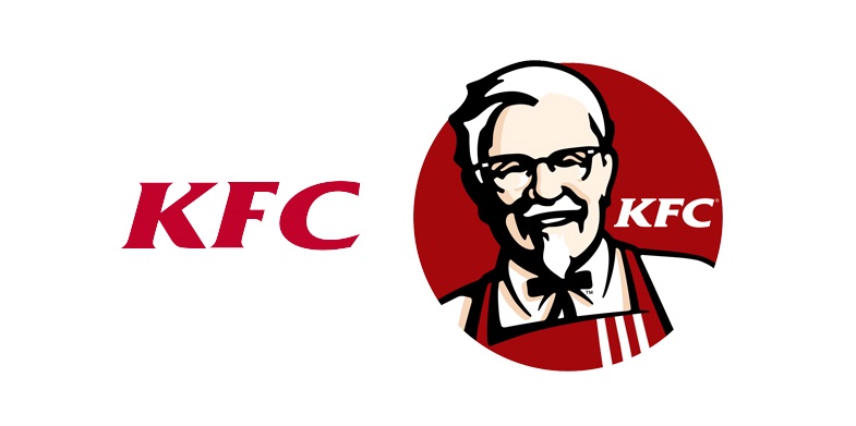
4. Ignoring symbolism
Some think symbolism is cheesy, but one look at the fast food industry proves that it’s effective. McDonald’s is a multi-billion dollar business—and those golden arches look a lot like the letter M. Taco Bell’s logo is an all-too obvious bell. KFC got more creative: the founder’s portrait lends the logo its personality. Without Colonel Sanders, the KFC logo would just be boring red letters.
5. Leaving white space unbalanced
The human eye is naturally attracted to white space, according to recent eye tracking studies, so good logos use white space to guide the viewer’s eye to the correct elements in the correct order. Leaving too much or too little space throws off the aesthetics, and the viewer will get “lost” in the design. On the other hand, giving each element its own white space balances the design and makes it easy to recognize.
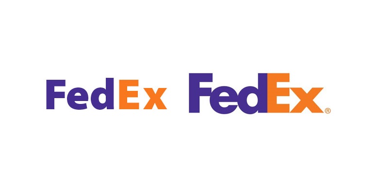
6. Not leveraging negative space
Negative space is the white space inside design elements, like the area inside the letter O. You can also create negative space by altering letters, like the FedEx logo. There’s an arrow between the E and X, because the designer conjoined the letters to optimize the negative space between them. Negative space lets you create hidden meanings in your logo that capture the audience’s imaginations.
7. Being too rigid
Logos must be adaptable to appeal to customers on all marketing channels. Not every medium allows for color, so a logo that requires color to distinguish its elements could cause problems later. Also avoid using elements that won’t scale. Very tiny or complex elements can get lost when shrunk to small sizes, and any element can look blurry when enlarged if you’re not careful with your design files.
8. Misjudging the target audience
It’s possible to create a logo that looks good but isn’t good for the brand. If you don’t consider the target audience—or don’t know who the target audience is—your design won’t appeal to them. That leads to fewer sales and can make your client feel like they paid for a design that doesn’t work. Fortunately, you can avoid this by asking your client about their target audience before you start the project.
9. Sticking to the status quo
Some colors, typefaces, and symbols are popular in certain industries. You should take note of these trends, but if you copy them exactly, the audience won’t notice your logo among the competition. Worse, you could get slapped with a $15 million infringement lawsuit like this company that ripped off Under Armour’s logo. If you’re going to follow industry trends, be sure to put your own spin on them to make your logo original.
10. Riding the bandwagon
As with industry trends, it’s easy to get caught up in the whirlwind of graphic design trends. The problem is that it can be difficult to tell if a trend is going to survive or die out, so you run the risk that the logo will become obsolete when the trend does. If you want to avoid costly redesigns and unhappy clients, it’s important to blend trends into your design, not to build your design on trends.

11. Boring the audience
Even the best designers struggle with a creative block once in a while. But they also look for ways to snap out of it—searching for inspiration around them, collaborating with others, taking a course to learn a new skill. The worst thing you can do as a designer is to let your creative block get the best of you and submit a boring logo to your client. This reflects poorly on you, hurts your client’s branding, and makes them far less likely to rehire you for their next project.
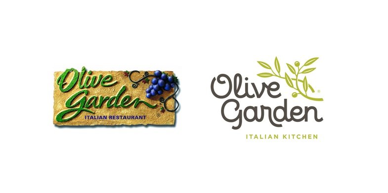
12. Making things too complicated
Good logos should catch the audience’s eyes with minimal elements. A logo that’s recognizable at a glance builds brand awareness and trust, because customers can find the logo easily when they need it. Olive Garden finally realized this during their logo redesign: they ditched the irrelevant 3D effects, texture, and grape cluster in favor of a clean design that features an olive branch.
There you have it: everything you need to know about how not to design a logo. Want to see how to do it right? Here are the 12 things you should do when designing a logo:
![]()