Artisanal graphic design is a style that aims to make products look handcrafted. Ironically, it has become popular enough that major brands have adopted it into their campaigns. The best way to use it is authentically, with emphasis on the human connection between the company and consumers. There are key fonts, colors, and imagery that readily identify this style. Artisanal design is inspired by community, nature, and current trends. It is important to remember that the goal is to appear thoughtful and passionate about every aspect of the product, service, or business. Incorporating one or more of the following characteristics can help you successfully add the popular look into your body of work.
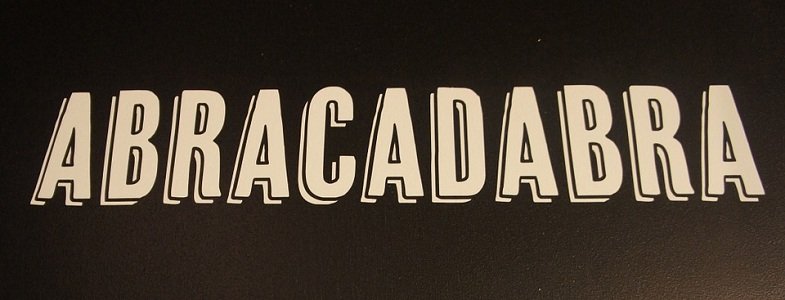
1. All Caps Fonts
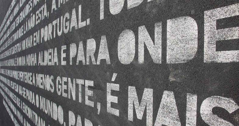
All caps fonts have replaced the sans serif favorite, Helvetica, in current design. One benefit of this evolution is the vast variety of capitalized fonts to choose from. This style can be used in logos, packaging, and signage. According the traditional principles, all caps used to be unacceptable. Keeping in line with the rebellious nature of current industry projection, creativity is now valued more than rules. Some favorites in this category include Adam.Cg Pro, Bernier, Fairview, and Mojave.
2. Scripted Fonts
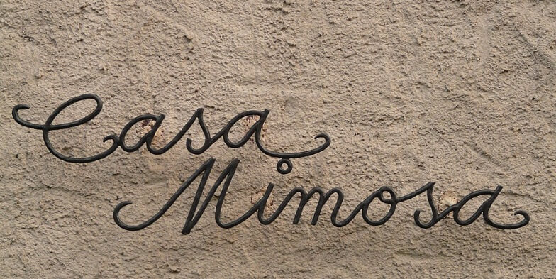
For artisanal design, scripted fonts are not to be used in conjunction with those in the all caps category. You will have to pick one. During the initial rough conception stages of a project, you can present a mockup of each, and let the client choose which direction to go. Scripts used to be another don’t, that have turned into a do. They only appeared in formal designs, but now stand up as identifiable branding all on their own. A tip for using handwritten or cursive fonts would be to stick with only one, and avoid combing multiples. Popular options include Fabfelt, Cutepunk, Nickainley, and Hitchhiker.
3. Solid Backgrounds
Solid backgrounds are all the rage. They have replaced gradients and textures as the go-to for displaying your design prowess. This makes it easier for beginning designers to get used to composition, without being overwhelmed by trying to master all of the software. Solid colors work as an excellent backdrop to both capitalized and scripted fonts, by providing simplicity. This strategy allows the thoughtful typography to stand out, and creates a definitive hierarchy. Popular solid background colors to use include coffee brown, light blue, coral, and medium yellow.
4. Banners

Banners add emphasis to artisanal design, and provide a convenient place to add taglines and dates, while drawing the eye to points of interest. Adding a solid background or thick outlines to the banner increases dimension. Use this element in combination with large circles to achieve a cohesive design.
Also See: 11 Pantone Color Trends for Spring 2016
5. Black and White
Common practice in graphic design dictates providing both black and white, as well as color options, for each concept. Over the past few years, this has changed due to the decrease in printed materials, and the increase in web-based formats. Black and white is now being used more as an identity instead of a practicality. Artisanal clients are exceptional candidates for exclusive black and white design due to the desire to embrace the past.
6. Embellishments
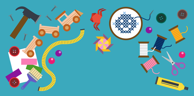
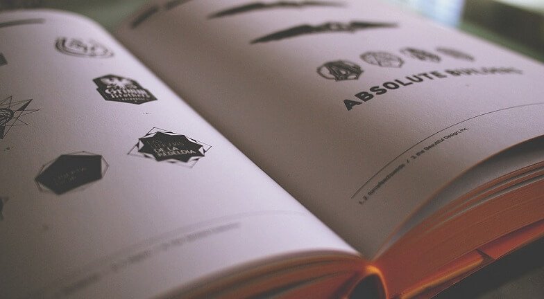
When an image is excluded in favor of type and color, embellishments can add visual interest to the artwork. The current reverence of calligraphy can be seen in the pen-like strokes that adorn the top, bottom, and sides of many logos. Additionally, multiple images can be combined in an ornate fashion to mimic Rococo and Baroque art history favorites.
7. Circular Elements

There are many examples of beloved circular logos that keep this trend alive and well. Some favorites include Starbucks, WordPress,, and Coca Cola. This style has been alive in mainstream design, but works just as well for smaller businesses. In addition to logos, comprehensive circular designs can be assembled to provide additional information on websites, business cards, and in editorials.
8. Arrows

Simplified arrows are used in the same way as embellishments to add an artistic touch to minimal designs. One, or more, arrows use carefully constructed lines to break up negative space, draw attention to important text, or add an artisanal feel to clean concepts. Similar elements used in artisanal design include crosses, anchors, ropes, antlers, and compasses.
Also See: 7 Logo Design Trend Predictions for 2016
9. Stamped Effect
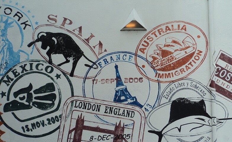
One way to break up solid blocks of color and text in artisanal graphic design is to texture it in a way that resembles a stamped ink print. This replaces other heavy background options while changing the effect. Instead of looking modern, it accomplishes the rustic revival that is at the heart of this design style. Photoshop’s blending modes are an excellent way to achieve this dynamic.
10. Reversed Out
Reversing a design means using light text on a dark background, instead of the other way around. This works nicely along with the solid color trend, to create an unexpected result. In web design, it provides more options in color choices and background images. When creating digital assets, providing a traditional option, and a reversed one, offers more flexibility on where the design can be used. Artisanal concepts often choose to use a reversed version as their primary brand identifier in order to achieve a vintage vibe.
11. Rustic Illustration

Rustic illustration is rapidly replacing crisp photography. Although stock images are available, it is recommended that custom artwork be commissioned when used in artisanal concepts. These illustrations should be easily recognizable in order to connect the consumer with the brand. Study retro styles from before 1950 to get an idea of what works in the handcrafted scene.
12. Mustaches
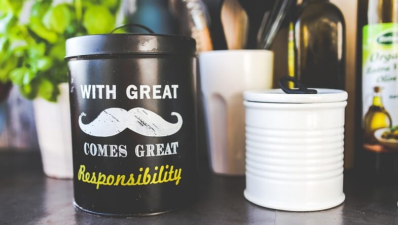
When in doubt, slap a mustache on it. Surprisingly, this trend works for concepts that have nothing to do with facial hair. It is a nod toward the maker, not necessarily the product, unless you are designing for a shaving cream company. Moustaches and beards have a cult following, which will likely enhance the profitability of this artisanal design.
Conclusion:
There are many ways to use graphic design to convey the authenticity of an artisanal concept to the audience it needs to connect with. Carefully selected fonts, illustrations, and embellishments will be easily recognized and adopted by the target demographic. It is suggested to only choose a few of these trends in order to avoid a busy design. Adding mustaches, arrows, and a stamped effect all-together will likely confuse the message you are trying to send.