
I think that sooner than later we’re going to replace the words mobile web design with responsive web design, but until then – I’m here to remind you of some of the fundamental tips that every webmaster should be aware of, when it comes to delivering a quality viewing experience to mobile visitors.
I wasn’t surprised to learn that there are a billion users accessing Facebook from their mobile devices. It makes perfect sense, as the prediction that the mobile web industry would explode has been in the cloud for a while now.
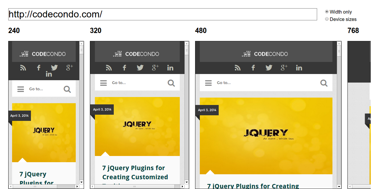
Nowadays, there are tools like the one displayed above, that can help us determine whether we’re providing a good user experience to our mobile users. You can test your own site by following this link, it’s a really easy to use tool – built by Matt Kersley.
But, in case you’re out of the water and your site isn’t responsive (yet), a good starting place would be the official Google’s developer guide on how to make your website responsive and mobile friendly. I doubt any tutorial is going to improve upon the quality of this resource.
Okay, lets take a look at some ways of how we can improve our mobile browsing experience for all involved.
Make Buying Accessible
You don’t want to have the user spending more than a couple of minutes on finding the buy button, especially if you’re selling products directly from within your website. Your product pages should be as easy to navigate as possible, to send a clear message that those pages are meant only for buying stuff.
Know the Limits
Quite often, developers will configure mobile sites in a way that a lot of the ‘big’ features that PC users get are being left out, and so the site at times can seem a little bland and not as engaging as it could be.
Mobile devices now support a lot of technology advancements, like flash for example. You can easily display interactive content to mobile users, though make sure it’s not content that would take days to load.
Website Speed is Crucial
By taking into account the above point, it’s obvious that we should keep our site clean of junk and unnecessary load times. It’s really important to make our website fast, but in a way that we’re serving mobile friendly content and files that won’t eat up all of the users mobile bandwidth limit.
Follow the UX / UI Trends
There is nothing worse than having a well designed website that is mobile friendly, but fails to pass the most basic user experience standards. Never use black background and yellow letters, if that makes more sense.
You should always follow the latest user interface guidelines, and make sure that the reading experience is flawless.
Offer a Choice of Both Web Designs
It doesn’t happen often, but sometimes – people who browse the web from devices like iPad, might actually prefer to browse the desktop version of the website, and so it might be a good idea to give them that choice of switching easily to the desktop version of the site, from within the mobile version.
That sounded a little bit weird, but I hope it makes sense.
Make it All Come Together
This is very basic advice, I know. But, it’s also very important, and I’ve worked countless hours on making my blog responsive to my mobile visitors. Yes, I might have used a stock theme initially, but I’ve done a lot of modifications and adjustments to really go that extra mile.
The reward has been a quite decent CTR rate for some of the forms I’ve put across the site, so good that I’m actually surprised – which doesn’t happen often.