Graphic design is a field where professional creates visual content for communicating messages in a more interactive way. Using different techniques, graphic designer fulfills the user’s need by displaying elements in interactive designs to optimize the user experience.
Going by history, graphic design is an ancient craft that dates back past Egyptian hieroglyphs to 17-year-old cave paintings. However, the term graphic design was first originated in the 1920s which mainly focused on aesthetic appeal and marketing for attracting all the customers by using colors, images and typography. Since then, graphic design has evolved significantly.
So without wasting much time, let’s get started with the top trends of graphic design which you are likely to see in the near future. These trends are:
- 3D design
- Asymmetrical layouts
- Art Deco
- Modern mid-century modern
- Duotones and gradients
- Warm and moody color palettes
- Custom illustrations
- Buxom Serifs
- Open compositions
- Isometric design
- Anti-gravity elements
- Vivid colors & dreamy color combos
- Metallic-effect
- Fluid & liquid effect
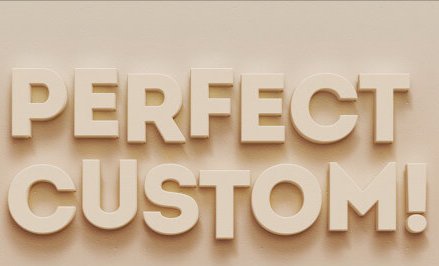
- Maxi typography
- Outline typography
- Text with background
- Alternative art
- Realism + flat mix
Read More: What is Graphic Designing And its Types?
3D Designs Always Works
3D or three-dimensional designs provide so much depth that you can’t resist yourself from touching it. In the last couple of years, the effectiveness of 3D designs has increased remarkably which is enough to believe that it is not going anywhere for the next few years. Another major factor for the increased popularity of 3D design is that in recent times, technology has also evolved significantly allowing graphic designers to create amazing 3D masterpieces.
Definitely the 3D design trend is going to be a huge part of web design and graphic design mainly due to the fact that the designers can create the masterpieces which will give users the feeling of the real world or can take them to an alternate universe and even in the future. Certainly, the possibility of this graphic design trend is infinite.
Asymmetrical Layouts, User Attention Is a Must
Slowly rigid-based designs are becoming the things of the past. Now designers are looking towards more bespoke and alive designs. And because of this, the concepts of asymmetrical design have grabbed everyone’s attention. These asymmetrical layouts break free from the regular rigid and predictable grid-based designs.
The asymmetrical form of design gives more kinetic energy and movement. Whether these designs are present on a website or an app, it demands the user’s attention. It creates the innate curiosity about where the information or graphics might go next, leading to the feeling of wonder among the users as they scroll or pursue any design.
Art Deco
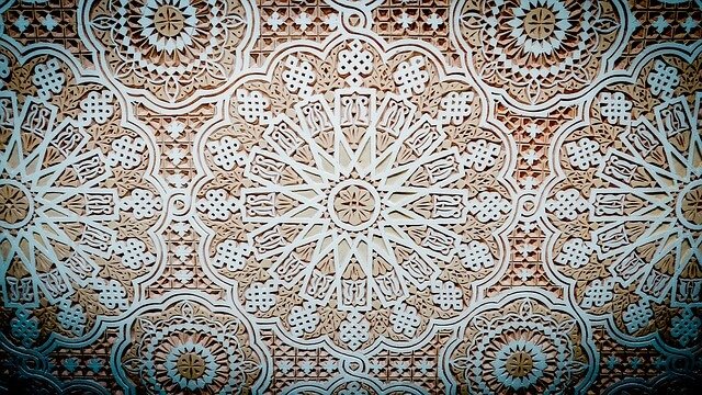
The artistic movement of modernism which started after World War I and continued for nearly five decades brought the “modern” design era. The two major styles from this era were Art Deco designs and the streamlined organic forms of the mid-century modern period. They are now experiencing a complete renaissance.
Art Deco is all set to blow all the design trends of 2020, especially in logo work. Designers are embracing this art form by combining it with sharp metallic which would make Jay Gatsby feel right at home. You can easily notice its influence in typography as well making the design more opulent and luxurious similar to the rustic, country-inspired work which dominated the last few years.
Modern Mid-Century Modern
Since the art deco period, designers decided to ditch the flashy design while embracing the stripped-down and organic clean lines. While this form of design was more prominent in the interior designs or the fashion industry, but now it’s steadily growing in the modern graphic design as well.
Recently a lot of startups or the brands having the gorgeous websites are full of these illustrations inspired by the mid-century. Often these designs are rendered in modern style while retaining the dreamy vintage color palettes. Because so this, we expect this design trend to dominate in 219.
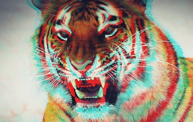
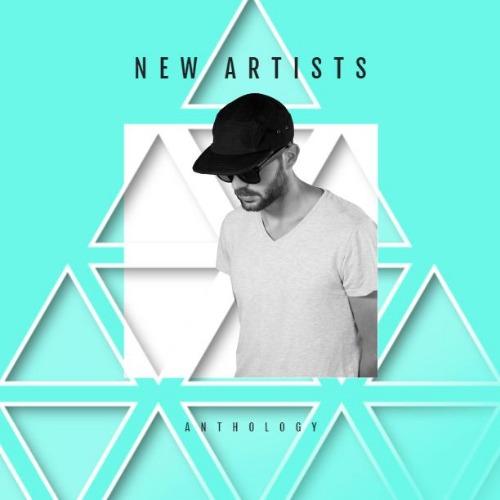
Evolution of Duotones and Gradients
Gradients or color transients which they are called have been the top trends for the last few years and snow, these are heavily used in logo designs. Gone are the days, when the logo used to have a single tone or color as now customers are more attracted to gradients. Some logos include the proven color combinations such as blue/purple, red/orange or others but others use more chunkier duotone fades.
In the last couple of years, already duotones were ruling but now multi-gradients have also become the trend in the graphical designing trend.
Warm and Moody Color Palettes

Because of the saturation of bold duotones, there is a steady rise of warm and moody color palettes or vintage tones for photos. A few years ago designers used to embrace bold and neon which was inspired by shows like Stranger Things, but today, the colors for photo feel more like the days when cameras were not able to capture intensely saturated colors.
It’s like a direct throwback to the low-fi photography from the 1970s or from the footage of a muted camcorder in eighties. After incorporating black to some degrees to these pictures results in a warm and wistful vibe that neon colors will never compete with.
Custom Illustrations Lighten Up
After several years of using bold, thick lines for illustrations, now a rise can be seen in more elegant and delicate illustrations. It is more influenced by natural or botanical elements that are more feminine and appeals to a more childish and innocent part of us all. It is majorly seen in packaging designs where intricate design is rendered beautifully against a textured paper background. These designs strike more balanced when used alongside premium materials like foil and embossing resulting in maximalism and simplicity.
Buxom Serifs: Typography Matters

As a change in illustrations can be clearly observed, similarly the fonts are beefing up too especially when it comes to serifs. Already sans-serif is popular and adding to it this will be the year where the range and diversity of serif fonts will explode as hand-drawn fonts are predicted to grow significantly.
In order to stand out from the rest, more and more brands are attracted to the custom type fonts and this is where signature serif type or something called logomark is what designers are turning towards. This is because clean serif fonts are now considered as soulless or characterless even after its years of dominance.
Open Compositions for Your Imaginations
Remember the old saying “leaving something to the imagination”? After years of using boxes and frames for elements, designers are now starting to willingly adopt more open compositions. These results in those types of graphic designs which only let you see a part of the whole picture leaving an entire world off the page.
Mainly these compositions eschew clear hierarchy and embrace white space by loosely tethering all the elements to each other as if they could float away. Open compositions are often broken and cut-up, seemingly chaotic and open styled which produces a very strong design since the placement of each element can be anything but random.
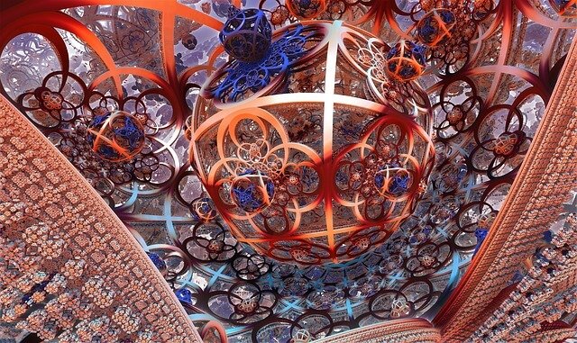
Isometric Design: Whole Universe
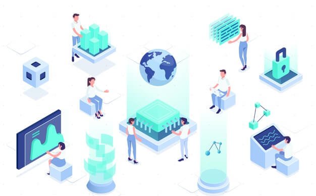
Contrary to open compositions where you only see a part of the whole picture, isometric designs create whole universe in tiny little spaces or by using the space effectively. It may sound a little technical but in reality, it’s a simple method where a 3-dimensional object is drawn in two dimensions. It produces a simple and clean design with a depth incomparable to any flat design.
Among different aspects of graphics designing, one is icons where this form of design is really heating the things up. All the icons based on isometric designs consist of a lot more warmth and tactility than any flat designs. Additionally, icons created with isometric designs have a smaller file size than any 3D-based icons giving you the entire bang with none of the lag.
Read More: Design Like A Pro- Create Infographics With Adobe Illustrator
Anti-Gravity: Flying & Floating Elements
As of now, we have not progressed that much in science to see flying cars but in the field of graphic design, the era of flying elements has definitely come. Flying and floating elements are one of the top graphic trends for the ongoing and upcoming years. The idea where designers create a design that moves and behave like they are subjected to an anti-gravity environment is enough to convey the overall feeling of freedom to the users. It is majorly designed with open compositions which boosts the major concept of a window to a different world as a user can see the elements floating in and out of the screen.
Here designers often mix the 3-dimensional techniques with the non-gravity concept which adds up to the realism of the composition. If you believe that 3D is something that unleashes the designer’s potential then for sure, the non-gravity concept gives you a green light to spice up the composition even more.
This technique involving the flying and floating elements also appears in package design presentations which give the feeling of a product coming out from a different world. It helps viewers to easily grasp the futuristic vibes by looking into the designs which naturally boosts the curiosity. It has a serious potential to transform an ordinary product into an extraordinary one. By going all these things, you can include the anti-gravity concept as one of the major graphic design trends of today and the future.
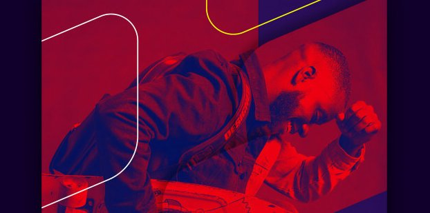
Vivid Colors: A Trip to Dreamland
Combinations of vivid colors along with the dreamy color transitions or gradients will continue to be a graphic design trend in the forthcoming days. These colors bring a futuristic feeling to any design which makes you feel like you are an alternative universe.
Frequently designers are using futuristic colors for creating the mesmerizing out-of-this-world designs as it really provides a lot of room for improvisation and imagination. Several graphic designers also combine trendy vivid color transitions with 3-dimensional visual techniques for even more powerful results. The combination of 3-dimensional technique and vivid color transitions truly results in a million-dollar combination for any designer even if it is used for typography design.
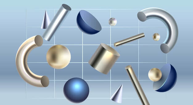
Metallic Effect: Shine Always Works
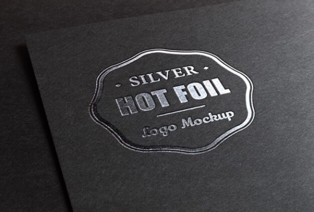
Have you ever heard of gold or silver going out of style? This is the reason why we think the metallic effect will be the trend of graphic design. In recent years, I can bet you will see a lot of metal elements incorporated into the designs.
When it comes to 3-dimensional designs, silver or golden or any other metallic elements are enough to make the whole design to the next level by making it look exclusive and expensive. These days, mixing various metals with an iridescent color effect has become quite trendy because it makes any design look enchanting and mesmerizing by showing a beautiful palette of lustrous colors when the light hits their surface.
You will often see some metallic elements like golden or iridescent on package design as it naturally gives the sense of exclusivity and luxury. Till now, metallic with black or white remains the classic combination for metallic effect but in the near future, you are likely to see a lot of golden elements on colorful designs.
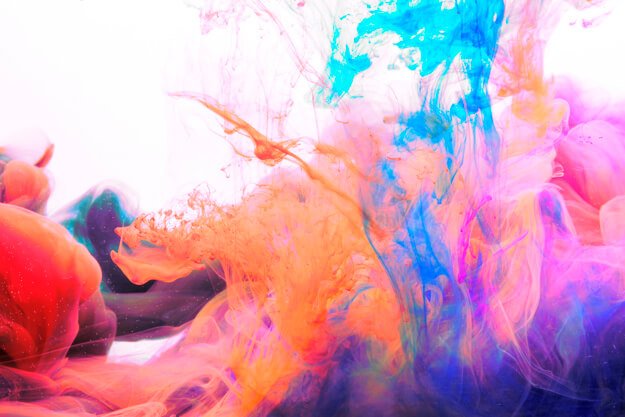
Fluid & Liquid Effect
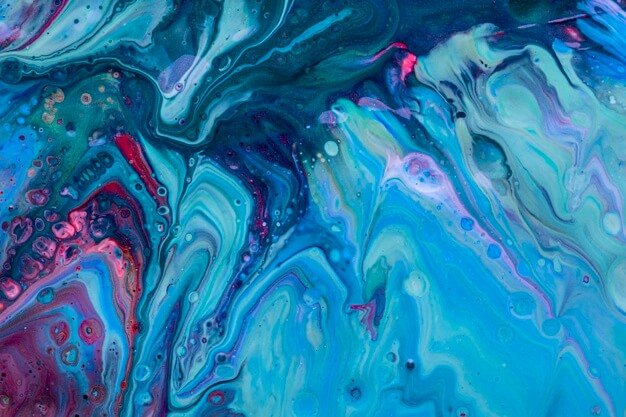
Without a doubt, this effect will be one of the boldest graphic trends in the upcoming future. Imagine where a surface of the water is translated into a graphic design!! The viewers will be simply awestruck by the designs. It may involve anything from water to oil to any other liquid substance inspiring numerous contemporary designs in the upcoming days.
When it comes to typography, the liquid design gives a lot of freedom for typography to any designer. With this effect, designers can easily improvise and give their compositions different unique effects to their designs as liquids have many states and thickness levels.
You can even observe different liquid effects or elements in the web designs too. Its combination with full-width open compositions will make the overall look of any web design more mystique and imaginary.
Apart from all these, even the patterns which will be inspired by this effect will be trendy. As when the liquid moves, it draws a natural path that will shape the unique patterns or textures inspiring graphic designers to a whole new level. When it will be combined with the floating elements and the futuristic colors, the whole composition can appear dreamy and magical for the audiences.
Maxi Typography for Maximum Impact
You can’t separate typography from graphic design though that’s a different story that some typography stays for years while others fade away pretty fast. As mentioned previously, typography can take different shapes or forms when combined for instance; it could be flat or can be in a 3-dimensional shape; it could be liquefiable or made with a metallic effect. Whatever the case is, one sure thing is that the most trendy typography in graphic design will definitely be maxi.
Furthermore, typography will also be actively involved in the design and for more impactful graphic design, time to time designers will surprise you with their creative pieces in which typography will be an essential part of the design. Mostly it may interact with real-life people or objects. Various combinations such as vertical or diagonal or horizontal orientation or even messy typography are likely to be in the trend for the next few years.
Outline Typography
Differing with other outline elements that have gone out of style, outline typography will make the headlines as it is gaining popularity by each passing day and will be at its peak in 2019-2020. While combining it with other elements in the compositions, outline letters will play an important part in graphic design or web design in the upcoming years. You will regularly see these styles in interior designs, website designs and brand identity designs as it will be marked with big outline lettering mixed with open compositions or 3-dimensional structures.
Text with Background: Retro Way
Some may consider designs having text on background boxes as retro but for many, it still brings the edgy look when a composition will be combined with any other design trends. We highly believe that the text with the background is very rebellious and youthful which may grab the user’s attention quite soon.
Alternative Art: Strokes, Stains, Spots & Doodles
In the upcoming years, we’ll see a lot of improvisations in the alternative art style. Doodles or freestyle illustrations are really fun to look at. And adding chaotic strokes or stains of color is enough for any designer to achieve an artsy looking offbeat design which will definitely create an impression on the observer.
This trend has already entered the graphic design field and is regularly used in combination with metallic effects. Here designers carefully select the right colors and the unique shapes along with the strokes and stains which certainly help the designs to escape the boring zone.
Since the past decades, we are used to see classical doodles with black and white illustrations. Looking forward to the technology and more modern designer’s approach, I can assure you the translation of the look like white on a dark background which may be combined with other design trends such as golden while at the same time keeping its simplicity of the illustration style.
Realism + Flat Design Elements
It’s the perfect example of the saying “opposites attract”. To please the viewer’s eye, time to time, graphic designers have combined and mixed complementing trends. However, when it is about designing something unique, unexpected and innovative, designers always go for an unconventional mixture of styles, techniques or in this design form- dimensions. In our opinion, real-life objects when combined with completely flat visual elements will be one of the most trendy graphic designs.
Read More: The Difference Between A Web Designer and Web Developer
Final Words!!
Today, graphic design has become an integral part of the digital world where creativity, mastery and most importantly the capability of a designer to think outside the box is very crucial. This is the reason; we brought you the list of top graphic design trends that you might see in the near future.
To sum up everything, we believe that the upcoming days of graphic design will be filled with vivid colors, glamour and the movement which will break all the rules ever been made in this field. From seeing a lot of open compositions to the 3-dimensional designs, from vivid color schemes to metallic elements, from typography to the liquid effect, we’ll be seeing the art in its most unconventional shapes, forms and of course, all the crazy combinations which we can’t even imagine altogether. Definitely all these will be enough to please our eyes and after all, that’s the point of this whole graphic design thing, isn’t it?
What do you think? Which trend or the combination will be going to rule graphic designing in the near future? Comment your thoughts below.
Such beautiful designs sure help the businesses in putting their services & offered products before the visitors in a creative manner.