
As technology advances and the world becomes more complicated, simplicity is a decided advantage. Consider Google for a moment. The search engine has become so ubiquitous; it may have been a while since you typed “Google.com” to go to the site’s homepage. Do so; you’ll see it remains the simplest homepage on the web. This factor contributed to the company’s domination of the search category. Where its competitors riddled their homepages with news, ads video and pictures, Google’s plain white background made it easiest to use. Take a tip from one of the world’s most popular websites. Simplicity stimulates sales. Here’s how you can apply this thinking to your ecommerce store.
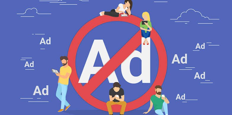
Kill the Ads
When shoppers come to your site, do you want them focused on your product offerings, or do you think it’ll be useful to pick up some extra revenue hosting Keyword ads, banner ads and pop ups? The simple fact is (you had to see that coming, right?) those things tend to annoy shoppers. When they’re focused on learning all they can about a product to make a decision, why would you distract them to gain a few pennies when there are dollars to be made? What’s more, hosting those banners and pop-ups make your site load more slowly, which leads to bounced visits and lost revenue.
Focus Your Homepage Around a Specific Action
Everything “above the fold” — the area of your site visible to the user before scrolling — should be about one thing only, focusing on the customer finding what they came looking for as quickly as possible. If your home page is simple, users will do what you want them to do. If it’s cluttered, they’ll wonder what they’re supposed to do, look around for a bit and if you’re lucky, find a lead to the item. If you’re not lucky, they’ll get frustrated, go to another site where they can find it more easily—and buy it there.
Pictures Speak More Than Words
Our brains process images far more rapidly than text. When your website theme makes good use of photography, users remain engaged with your store for longer periods of time. Further, pictures are universal. If a person who isn’t fluent in the written language of your site comes looking for a product, great pictures will help them make a purchase.
Seven Is Your Lucky Number
Our short-term memory can only store and recall seven items easily. If you’re giving users more than that to consider in your menus, you’re frustrating them. The more choices you give a person, the greater the odds of inciting indecision. This makes people reluctant to buy, as they’re looking for confirmation the decision they’re trying to make is a sound one. Give customers too many options they sometimes avoid choosing anything at all.

Jettison Dead Weight
Monitoring your site’s analytics will help you determine which buttons are being used and which ones are just taking up space. If you find links are going uninvestigated, get rid of them. Why keep something around if nobody’s using it? Think of your screen space the way brick and mortar merchants think of shelf space. If a product is just sitting there day in and day out, they get rid of it to give something else a chance.
These are just a few of the ways you can introduce simplicity to stimulate sales. The key takeaway here is the more difficult you make your ecommerce site to use, the fewer conversions you’ll see. It’s as simple as that.