Back in the days when people had dial-up internet connections and low-resolution computer monitors, web designers got into the habit of limiting animations and moving parts. After all, a site with very few scripts loads much faster than one with many. While this can still be true, some effects add to the user experience (UX), and they’re worth embracing as a business.
The customer experience has a huge impact on revenue. Even in the middle of challenging economic times, 36% of companies paying attention to CX said they exceeded the goals they set for the year. People may spend less, but they are being choosier about where they do spend. Meet their expectations, and they’ll choose you.
One way of easing the CX is by making it clear what action the user should take next. Creating a hover effect allows you to grab attention and shows you can click on an object or gain more information in this location.
Here are some things to keep in mind about the hover effect and examples of sites utilizing it to their full advantage.
1. Focus on New Items
One way you can use the hover feature is by highlighting new content. When the user mouses over the image or grid box, the entire thing shifts. You can highlight it with a semi-transparent color, change the image, or zoom in. The effect isn’t as important as showing the visitor this is something attention-worthy.
You’ve likely seen the style used on sites you’ve visited recently. It can even enhance a slideshow. People can see in a moment what you’ve added that’s new or exciting because it’s highlighted in some way.
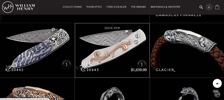
William Henry sells beautiful, handmade knives. As you enter their product pages, they set off each one with a relevant image. Notice how when you hover over each choice, the box around the image gets outlined in white, and “Quick View” appears with the price for the item.
The subtle effect enhances the user experience. It makes a visit to the site more interactive. Users know as they hover over each item that they’ll be able to see the price and decide which one might suit them best.
2. Highlight Calls to Action (CTAs)
One of the most common uses of the hover effect is to draw attention to the CTAs on your page. You want the user to make a path through the sales funnel. You can point them the right way by having the button change in some way as they hover.
There are many different effects you can utilize here. People are used to seeing the color shift, but you could also do something like outline the box, replace it with an image or add sparkles. Think about what looks matches the action and how you might do things differently than your competitors.
Also Read: 10 Ways To Make A Compelling CTA For Your Website
3. Add Details
You can also use the hover effect to add details you may not need if the person is interested in something else on your page. If you serve multiple types of industries or offer various services, then using only headlines on your landing page is smart.
As the person expresses interest in a topic by hovering over it, the image morphs and you can add additional text, a video, or another image. Such effects keep your page skimmable while still imparting the information users most need based on their reason for visiting.
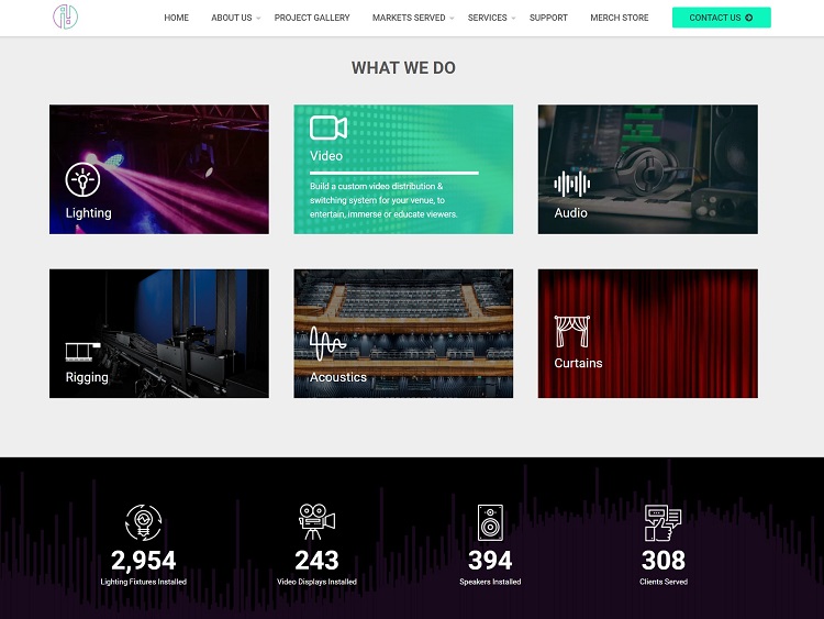
Illuminated Integration adds details on hover for the different services they provide. As you scroll down their home page, you see that they provide lighting, video, audio, rigging, acoustics, and curtains. They divide the different options into a grid-style layout, giving each its own image and a box.
When you move the mouse over any of those services, you get more details. For example, for Audio, text pops up and lets users know every space needs audio and that they cover both design and installation needs. Clicking on the box takes the user to a more detailed page.
4. Consider Mobile
When you’re adding a hover effect to your site, keep in mind that your mobile users won’t be able to hover. They use touchscreens, so images will remain static. Think about how you can create a similar appeal for mobile devices.
Make sure the design is responsive, too. Sometimes, a feature such as a hover will freeze on a smartphone. If your site freezes, you’ve probably lost a customer. Fully test any added features to make sure they adapt well to any type of device.
You must do more than just test on your desktop. Grab both an Android and iOS phone and click through everything on your pages. If you have friends with smartphones, ask them to test your site, as they may find problems you didn’t encounter.
5. Zoom In on an Image
Want to create an intimate feel on your page? You can use a hover effect with a zoom feature to get up close and personal. Whatever you’re trying to promote, you’ll be able to show more detail with a closeup. This also allows you to start with an image that encompasses the surrounding landscape and then add to it.
While all hover effects are created in a similar way and respond to the user placing the cursor over the element, the actual movement varies widely. Think about what has the most emotional impact on your target audience and go from there.
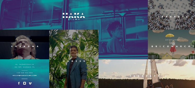
Haka Films uses a zoom-in feature on their images. This gives the user an idea of what each film might be about and then makes it seem more intimate as they hover and it closes in. It also creates a cinematic effect that’s perfect for a film company website.
6. Tap Into Emotions
You can tap into human emotions with the way you utilize your hovers. What are people dealing with when they land on your page? Know what your target audience’s pain points are and the feelings they evoke.
Someone buying a security system for their home may be dealing with fear. How can you help alleviate that emotion? Perhaps you start with an image of a burglar getting ready to enter a home, and when the user hovers, they see the alarm going off and the burglar running away.
Consider what they need from you and how your hover effect enhances your solution to their problems.
7. Animate the Effect
One recent trend we’ve seen a lot of recently is animation. Screen resolutions are more pixel-dense than ever, and internet content loads faster and faster. These changes lend themselves to greater numbers of animated effects than in the past.
An animated effect occurs when the mouse hovers over something on the page. You can use it to highlight products, point the user to a CTA, or just to grab their attention.
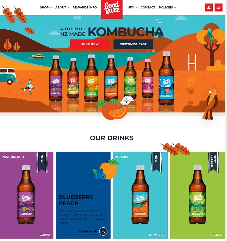
Good Buzz sells a variety of healthy drinks. As you scroll down the page, some pretty leaves follow your progress. When you mouse over the different drinks, the block turns a solid color, and an animated fruit image appears.
For the orange turmeric, orange and slice of orange appear. For the blueberry-peach flavor, both fruits pop up when you hover. It’s a fast and fun way to communicate which ingredients are in each drink.
8. Increase Your Sales
You could also use the hover effect on an e-commerce site to increase your sales. When the person hovers over the image, they see additional suggestions or more details. Use hover to upsell, to convince buyers why they need a product, or to showcase additional slides and details.
The more you can make the item seem like something they can’t live without, the more likely they are to buy it. You could also highlight the “Add to Cart” button to encourage interaction with the shopping cart.
In a competitive online environment, anything you can do to encourage conversions and bigger sales numbers will increase your revenue. Someone getting ready to buy an item is more likely to add another one to the mix, especially if you offer free shipping over a certain amount spent.
Consider adding a mouseover that reminds them they have a certain amount to go to reach free shipping, such as when they hover over the checkout button. Think through the impact you want your hover effect to have and the best placement and method to achieve the goal.
Use With Caution
While hover effects can create powerful opportunities for interaction, you don’t want to overuse the technique. If everything on your page does something when the user moves their cursor over it, it loses its impact.
Instead, think about the areas where you most want user attention. How can you showcase just the right things and nothing else? You also don’t want to drag down your page or create lagging load times. Use the effect sparingly, and you’ll gain more momentum from it.
– Originally written by Eleanor Hecks (Editor-in-chief at Designerly Magazine)
Also Read: 10 Powerful CSS3 Animation Libraries for Hovering Effects