I think we can look at it in two ways, one is that we create our own principles of how we think a web design should flow through the page, and the other being how the largest part of the web users see the user interface principles as right. We have to be really careful when it comes to following the rules, people are bound to come up with all kinds of excuses when it comes to a bad design.
I’ve mentioned this at least two other times in the recent past, and I’ll mention it again – I believe that every webpage should have two things in mind when it comes to a good design:
- 1) the content
- 2) everything else
It allows to quickly switch from one thing to another, avoiding distraction that for example news sites provide to users. Just take a look at three different news sites and you’ll see what I’m talking about, the focus is being put on everything and it’s hard to know where to look first, it’s freaking news everywhere!
Simplicity
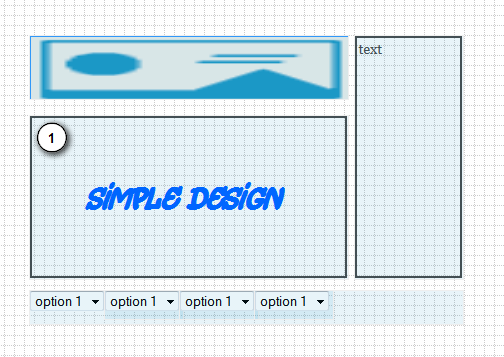
I’m a big fan, and so that’s the first user interface design principle I want to take a look at. The below design examples were built with a platform that can be found in the free wireframe tools post I’ve published a few days ago.
Simple Design Example
Bad Design Example
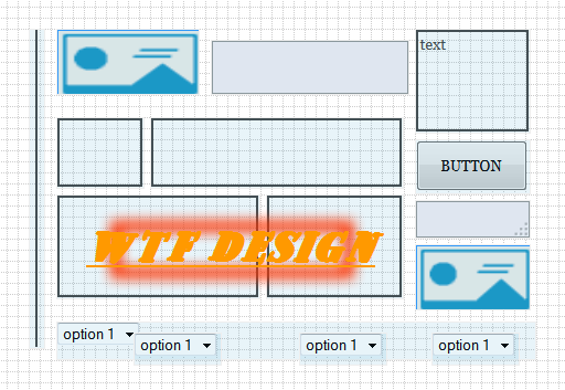
I think we see this type of back and forth every day, depending on the amount of new pages we visit. Your design should be simply, allow simple tasks to be easy spotted and completed, and provide simple enough breadcrumbs to navigate the website at ease, without having to think where the next link is going to take the user. That is the first design principle we need to understand.
Repetition of Design Elements
This one is less common, but nonetheless important when it comes to a good user experience. You should never use different elements for all of your websites pages, forcing the user to analyze and remember each of the page as a unique set. It’s best explained if we take for example sidebars on WordPress blogs, and how they’re always the same for each page (unless specified otherwise), it makes switching from content to off-content that much easier.
Words are Just as Important
We can have the most beautiful interface design in the world, where every single pixel is shining – made of gold – and making the website users go into amazement. The moment user realizes that content of the website isn’t up to par with the style of the design, you better be prepare to lose him forever.
Unfortunately, a lot of the early adapters of the web have been taught to believe that a website needs to have a good design in order for it to feel legitimate, but about content? I don’t think we can avoid the aspect of having great quality content alongside our great design.
Ask Yourself: Will the User Appreciate This?
Whenever you’re making changes to your user interface design, always remember the principle of asking yourself whether the user actually needs to see the new feature, and will it add more than 51% of value to the overall design? This leads us back to the simplicity statement, and building a cluttered page is one of the easiest things in the world to do.
Sure, widgets and fancy scripts can be fun to play with, but they can also scare away those who’re more serious and don’t really like to have snow falling alongside their mouse cursor.
Make it More Easy to Navigate
All things aside, we want to make it extremely easy for our users to navigate our website. In the age of JavaScript, jQuery and other fancy coding environments, it’s not very hard to offer a user keyboard shortcuts to make navigation easier. Let’s say you’re using one of the jQuery gallery plugins that I’ve recently blogged about, you’ll essentially want to make sure they provide keyboard shortcuts to browse the images.
Why? Because I think that even the simplest of web user understands it’s easier to navigate a 300 picture photo album with the left and right arrows, than it is to sit and click the mouse button all the time.
You can check out a great post ‘The Web is the new Terminal‘ – in which Scott Hanselman discusses the evolution of web, and gives you a couple of hints and tricks on how to provide a better user experience.
photo by uqidea