Logos are essential on any website because they are used to represent a brand. The best logos are said to be those that can combine graphics with text perfectly in order to clearly communicate what a brand stands for. A designer that is able to come up with a flawless and unique design is viewed as the best.
It should be noted that logos are meant to be easy to understand in a simple but very attractive manner. Keeping a logo as simple as possible is important. A mistake that should be avoided is adding too much graphics or text. This can be off-putting and could even lead to confusion. To really capture the attention of your visitors, you need to make use of negative space adequately. Here are some stunning designs that you can use for inspiration.
1. Kolner Zoo
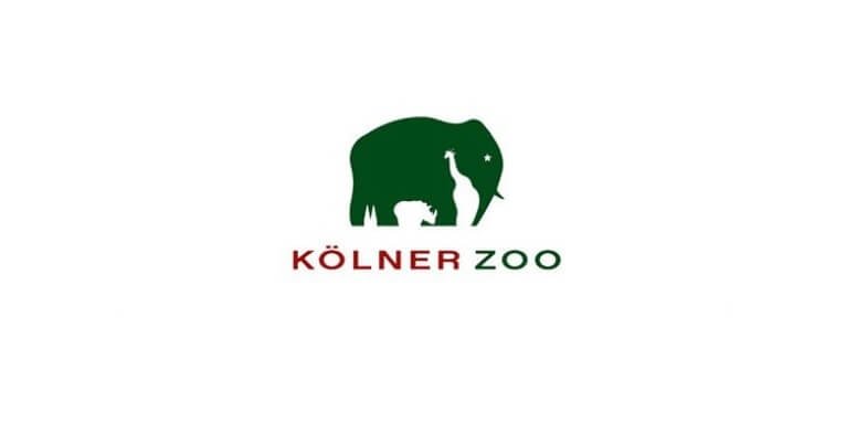
At first glance, this logo appears to be an Elephant, but a deeper look reveals that it contains so much more. To provide the outline of the trunk, there is a giraffe created from negative space. Then there is the rhino at the bottom of the logo that defines the legs of the elephant.
2. Whitewashers
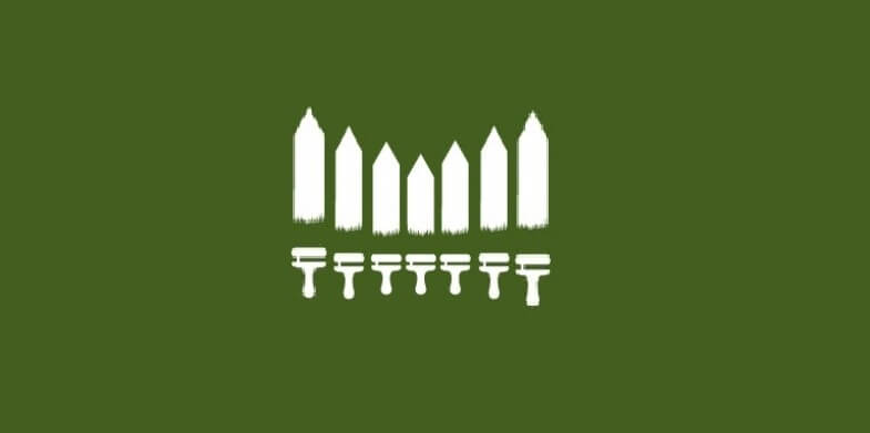
This is a very simple but great looking design. Against a color blocked background, the simple use of negative space expresses what the services is all about. The design is quite clear and easy to understand and it can work for any outdoor maintenance company. The designer chose a fence and brush design to bring out what the brand in a simple manner.
3. Franz Bernard
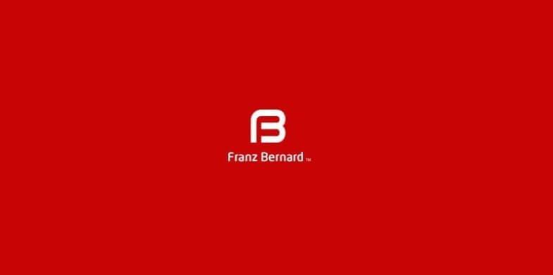
This is a simple yet easy to understand design. At a glance, you can easily see an F and a B that represents the brand. It is simple, and with the name below the symbol, also informative.
Also See: 7 Logo Design Trend Predictions for 2016
4. Gravity Custom Web
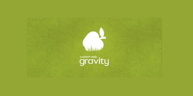
The design of this logo plays on facts and discoveries, and gets one thinking about certain concepts. The concept of gravity was defined when the apple fell and hit the ground, and this logo expresses this fantastically. It is ideal for use in a creative agency or web site.
5. Unique Idea

Just as the name suggests, this is a very unique design. It features a unicorn, a mythical creature that is similar to a horse, but different due to the long horn. This is the unique part. The negative space has a light bulb, which is a universal symbol used for an idea.
6. Roostar 2
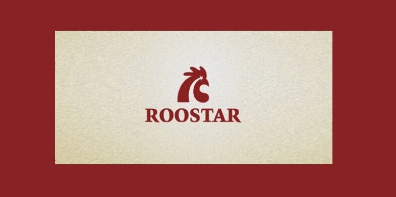
This is a play on words as well as the picture, as the coloured section of the logo has the silhouette of a rooster’s head, and the negative space has what appears to be a shooting star. The word that is at the bottom brings these elements together.
7. Arts Magazine

A careful look at this logo reveals the use of negative space to clearly define the outline of a pencil. The text on the logo helps to bring this visual element to life, linking the art magazine to a tool that is used for drawing.
Also Check: 10 Resources on How to Design a Logo
8. Hafiz Bacote

In this design, the text has been used to create dimension, with a logo that has depth and meaning. At first it the letter H, which stands out in bold white. However, the letter B has been formed within the H, making use of the negative space at the center. This would be an excellent logo for a professional website.
9. Taurus Construction

This is a very beautiful design for your inspiration. It features the head and horns of a bull, which links directly to the word Taurus. For the element of construction, negative space is highlighted as the face of the bull contains a C which is formed from the head of a hammer.
10. Silk Skin
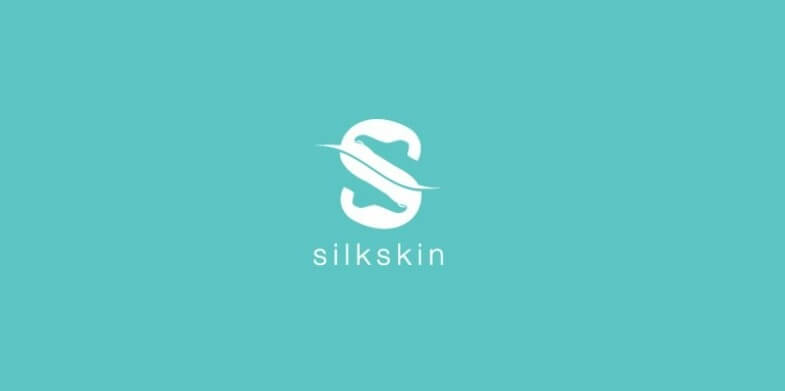
This is a very stunning negative space design. At first glance, it simply appears to be the letter S, but looking a little deeper, you will notice the feet that are pointed at the toe make up the negative space. This would be ideal for a spa, or even for anyone working within the healthcare profession, as long as they are dealing with feet.
Check Out Types of Logo Design To Help Create A Brand Adhesive Logo
11. Chemical design

This is an example of a logo that has understandably used visuals and negative space to communicate what it stands for strongly. It is suitable for anything within the chemical industry and the negative space gives the impression that the beaker is yet to fill up.
12. Altorius
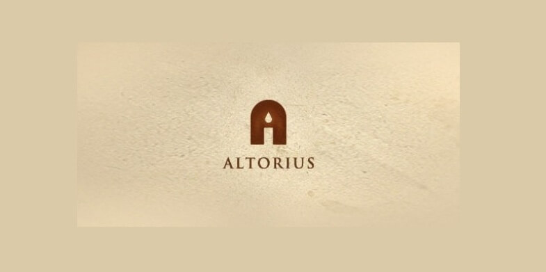
This is a very attractive and definitely inspiring negative space design. It simple embodies a candle that appears to be by a doorway or a window. It is meant to reflect a religious place where people may go to worship.
13. Foooblr Logo Design
![]()
When you look at this logo deeply, you will realise that it has something to do with football. This is because of the hexagons which are characteristic of the ball that is used in the game.
14. Explorations

This is a great looking design that can inspire you for your logos. It tells a story, revealing an adventurer standing on the edge of the cliff looking forward. This form is created from negative space that is taken out of the rising sun. The text also solidifies what this logo is all about.
15. Spartan Golf Club
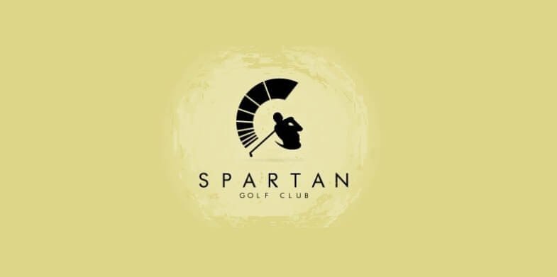
This logo has used negative space to create a symbol that strongly resembles an optical illusion. At first glance, you are likely to see a Spartan who appears to be wearing an army helmet and staring straight ahead. Looking a little deeper, you will notice the golfer, who is holding his golf club and appearing to take a swing.
Your logo needs a great looking design that is easy to understand because this is the design that will sell out your brand to online buyers. Now you can see how to use negative space to bring out the best of what you offer. Negative space is a highly creative space.