
Usage of the internet over desktops and laptops has decreased drastically in the last few years and mobile devices have taken over. If this trend continues, mobile users will outdo desktop users very soon, which means that web developers will now be designing websites and apps for mobile users more than desktop users. For a long time now, web developers have been designing responsive websites in order to accommodate both desktop and mobile users.
Despite the fact that this is a great strategy to use, web developers need to realize that there is a lot more that needs to be done in order to give mobile users exactly what they are looking for so that they too can enjoy internet access regardless of the device they are using. Here are some of the best practices that web developers can adopt to help increase mobile user experience:
1. Use understandable and focused content
It is important to understand that there are thousands if not millions of people across the country that access the internet on their mobile devices when they are on the go, sometimes in a hurry or while doing something else. The fact that the mobile devices do not accommodate a lot of content easily due to their small screens makes it hard for users to understand what you are trying to offer them if you crowd your page with too much content. That is why you have to be careful on how you post your content when you are designing websites for mobile users. Try to be as minimal as possible, use a few words to tell your visitors where to get what they are looking for, and present your brand in a clear and focused manner without using too many words.
2. Leave the images out

When designing for mobile users, you must to take into account the speed and size of the devices they are using, as these are the most important elements to consider when designing for these devices. Therefore, images are not very important. While images do add some effect to the design, you may not have the space you need for this, especially on smaller devices, and you may leave out important information if you use images. Mobile users would love to see text as text, and if you have to use images, then they have to be few and small in size. Use of fancy fonts is not a good idea for mobile designs either. Your users will only want to see what you are dealing with and be able to get the full message without spending a lot of time on the website.
3. Design for touch screens

People no longer need a keyboard and mouse in order to use the internet. Many people now use touchscreens on their phones to access any site they want to use, especially mobile users. Therefore, web developers have to acquire the skills that are needed in order to design applications that are compatible with touch screen devices, which are different from the skills they used to design for laptops and desktops, in order to design websites that can be used effectively by mobile users. Ensure that you accommodate fingers of all sizes when designing your apps, because different people will be touching their screens to access the websites you create. Also, all buttons have to be larger than normal so as to make it easier for users to touch without missing them.
4. Keep your menus and navigations simple
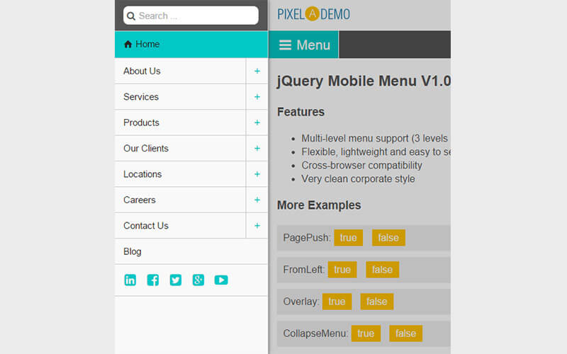
A detailed menu and navigation site obviously takes a lot of screen space, something that is not available for mobile device users. While this is something users need, you have to keep in mind that everything needs to fit on a smaller screen. That is why web designers should now start designing simple menus and navigation bars in order to provide everything the user needs on that small screen. Make all the buttons easy to access, without using multilevel menus, which could take too much space on the screen.
5. Keep your layouts flexible and fluid
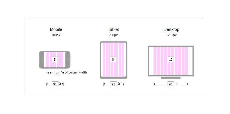
Note that different mobile devices have different widths, therefore, when designing you need to keep this in mind and not create designs for a certain width size as this will make your applications inaccessible to some users. Make your designs flexible enough to fit on any sized screen.
6. Make typing easier

Typing on a small gadget is not easy, especially if you have to use all the keys available on a normal keyboard. Web designers can do a lot in order to improve mobile users experience when it comes to this. For instance, they could make forms shorter or smaller. Ensure that you provide the most important keys first, and then make all the others easy to access. You can include auto-fill too, especially in those fields that are used repeatedly in order to decrease the amount of time a user take when they have to enter information into different forms. Also, keep the labels visible , even when the user zooms in and out of the screen.
7. Emphasize on mobile specific features

There are certain features that are only available for mobile devices, and are not available for desktops and laptops. Some of these are GPS, slide to unlock, the call button on a website among others. You have to identify all these different unique elements and then decide on where you can use them in your designs in order to improve your users’ experience. Some of these features can improve your user engagement, and ensure that your users are get everything they need before they leave the site. For instance, you could include a call button on your website so that your users will have easier access to you and your team to learn more about the brand you are selling.
Designing for mobile users goes beyond designing responsive designs. There is a lot more that mobile users need in order to enjoy using the internet, and listed above are just a few of the things that web developers should be working on in order to design websites and applications that will be useful to their users. However, you should not forget that there is a lot more that can be done in order to improve mobile user experience.
Hey Marc,
Great article! I think you brought up some great points about creating a great mobile user experience. I especially liked your point about keeping menus and nagivation simple. Users have a lot of choices when it comes to picking an app and making the app as easy and simple to navigate is imperative. If it is at all confusing or difficult a user could easily churn.
One way to evaluate an app’s navigation is with qualitative analytics. Qualitative analytics can show you the actual visual data with user session recordings and touch heatmaps. This way you can watch your users’ journeys and how they interact with the app. A great tool that can do this is htpp://www.appsee.com.
Would love to hear your thoughts?
Cheers!
Emily
This is a wonderful write-up it helped me in completing my research. Thank you for sharing.