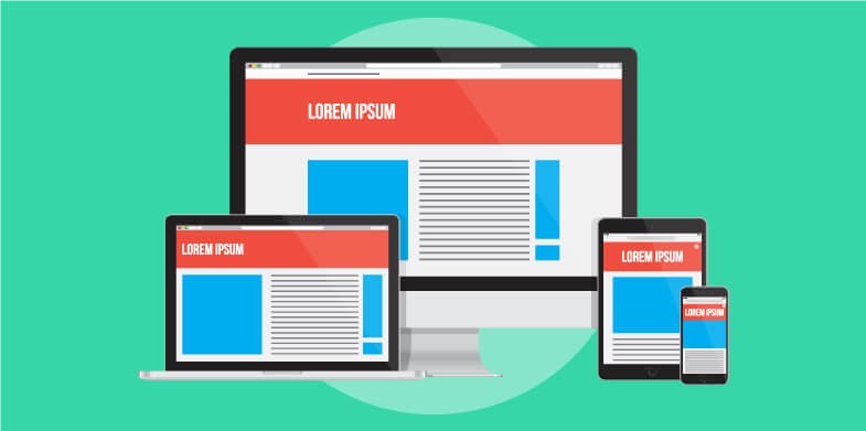
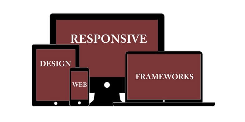
There are enough frameworks for designers and front end developers to choose from these days, most of which are ready for prototyping and implementation. You will get the best comprehensive frameworks as well as those that are light in weight, anything that you need for your next project. Designers have a wide range of these frameworks to choose from these days. Therefore you can choose what you prefer to work with, whether it is the most popular framework or one that can give you the desired results.
What is important to note is that all these frameworks are different, and they offer different solutions. Each has its own advantages and disadvantages; therefore the right choice has to be arrived at. Here are factors you can consider in choosing the best responsive design framework for your coming projects:
1. Simplicity to learn
A simple to learn responsive design framework will be very easy to use especially if you are just a beginner. You therefore need to choose one that has a shallow learning curve, one that is user-friendly and one that is designed for beginners as well. Choose one that has light features too, so that you will have an easy time using it to get your desired results. Its documentation should also be quick and simple to read. There are design frameworks that have exceptional documentation to guide the user through the setup process, modules and extensions. Even when such frameworks have a wide range of features, it becomes easy for a user to understand how these different features are used to achieve certain results. Such frameworks are for instance Bootstrap and Foundation. Foundation comes with a demo file that acts as a starting point and is meant to help newbies with experimentation.
2. Volume of external resources
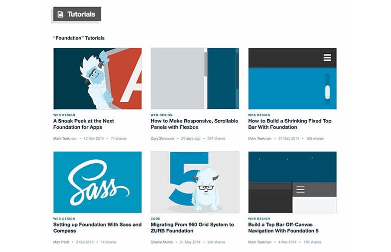
Other than the documentation, you need enough external resources to help you understand how best to use your chosen responsive design framework in order to achieve the desired results. Choose a framework that can give you extra help that you will need along the way when you conduct a quick Google search. There are frameworks that have their own training centers plus tons of videos that will give you a seamless learning experience. If you are the kind of designer who prefers working with a few tricks and tips here and there, you should chose a framework that has enough blogs and tutorials written on them. Some of the best options you can go for in this case include Tuts+, Foundation, Gumby, and Bootstrap among others.
3. How light it is
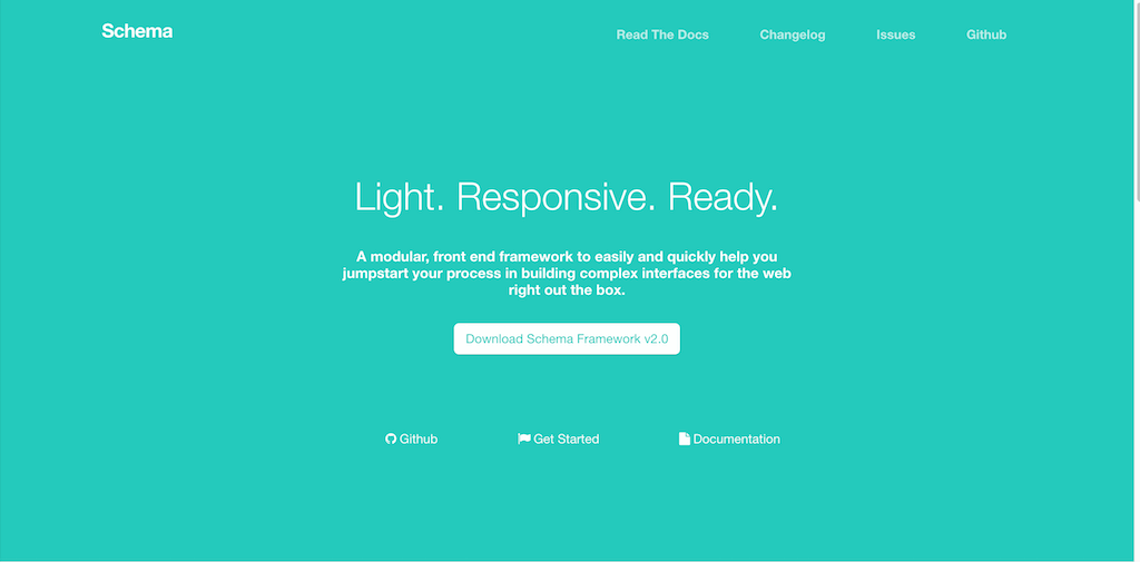
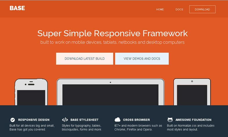
Designers these days prefer frameworks that are minimal and light in weight. The advantage in using these kinds of frameworks is that they do not require a lot of resources and will not rely on any specific style of grids and templates. Lightweight frameworks are very easy to learn and master, therefore they will be easy to work with. Some of them are designed to only provide the most necessary features, that is why they are quite small in size. They do not affect page load time as well, which is an added advantage. There are quite a number of great lightweight frameworks you can choose to work with today, for instance Schema and Caramel.
4. How adaptable it is
It is always good to consider how flexible a responsive design framework will be to use. Fortunately, there are quite a good number of frameworks that come with great resources and features, which can be customized even before you download the files. Some of these frameworks are very versatile even in the way you can use them, in terms of app prototyping and combination with CMS. With a framework like Concise for instance, you only get the essentials because the framework has been built to be small. You will get what is absolutely necessary from its after which you can build what you prefer to work with from the small app. This is in fact the best option for designers who want to design their own UI elements.
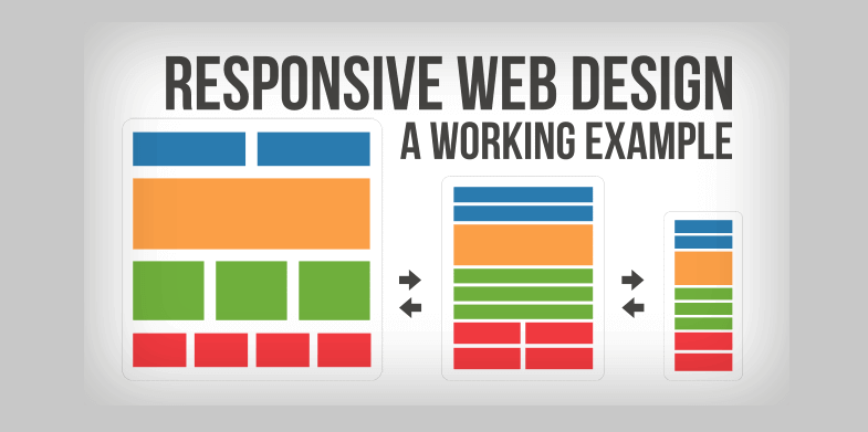
5. Browser support
Browser support is very important if you want to reach out to more users on different browsers. Since, a lot of web surfing these days is done on mobile devices, there is still a good number of users on desktops and computers. It is therefore not enough to design websites that are mobile friendly only, because multi-browser experience is also very important. Since you are building for different types of users, it is important to determine the kinds of browsers they might be using since not everyone is using the same browser, then choose a design framework that supports most or all of them. Go through each of your preferred design framework and understand how all its properties will be rendered in the different browsers you want to design for, which will help you make the right choice.
6. Accessibility
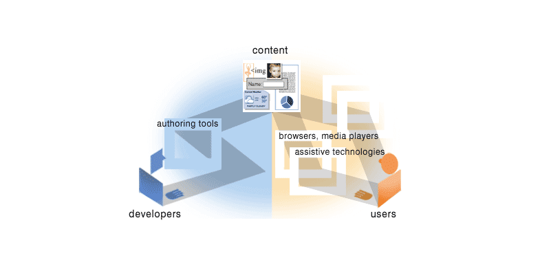
The kind of design framework that you choose should promote accessibility in that it should be able to overcome any barriers that might prevent interaction with or access to websites especially by people with disabilities. It is important for web designers to ensure that all users will have equal access to information and functionalities of their websites by using design frameworks that will help them design, develop and edit their websites correctly.
It helps a lot to choose a good design framework for every project you undertake. With these factors in mind, making a good choice of design framework form the many responsive design frameworks that are in use today should be easy, and then you will have the best results and an easier workflow. Design frameworks are meant to fit in different types of projects, therefore have your project needs in mind at all times, and you will pick out the best to work with.