One of the rules web designers have to abide by is to design websites for their audience first, then they can consider the needs of the masses. This has become a requirement by Google. A designer must take into account the device size and the browser the page will be viewed on when considering designing a website. This is because people are using different devices these days to access the web. If you want to rank high in Google for competitive keywords, you have to ensure that everyone is able to access your website with no issues, irrespective of the kind of device they are using. This is what brings us to the question, how can one get their website layout dimensions right?
To be able to answer the question, a web designer needs to know the kinds of browsers his target users are using, the kinds of devices they are using to access the web and their screen resolution as well as the amount of space taken by the browser toolbars. This is what will guide you on the right dimensions to use on your website layout.
Since 2005, Google started insisting on mobile-friendliness as a ranking signal for websites in order to encourage web designers to design websites that can be viewed not just in desktops andlaptops but also on even the smallest of mobile devices. This is because a lot of people are using mobile devices to access the web today, and everyone has a right for the same search results once they Google something on the web. This is what has led to the need to design responsive web designs, in order to give in order to give high quality search results to everyone that is using the internet irrespective of the kind of device they are using.
Designing websites that look the same in every browser
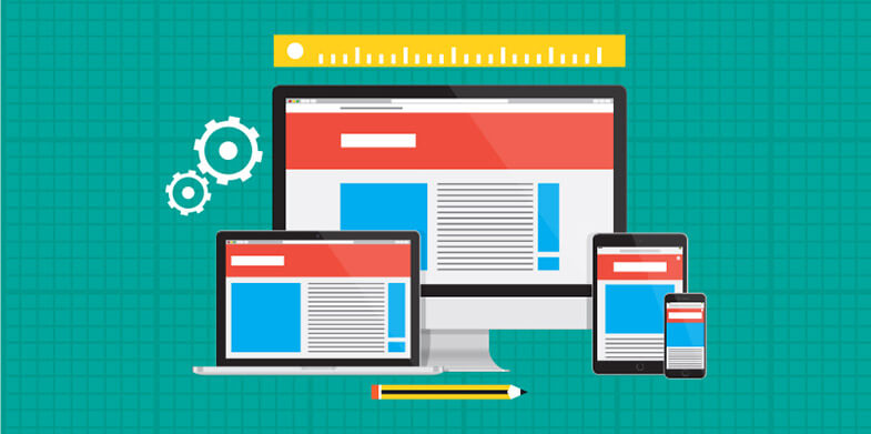
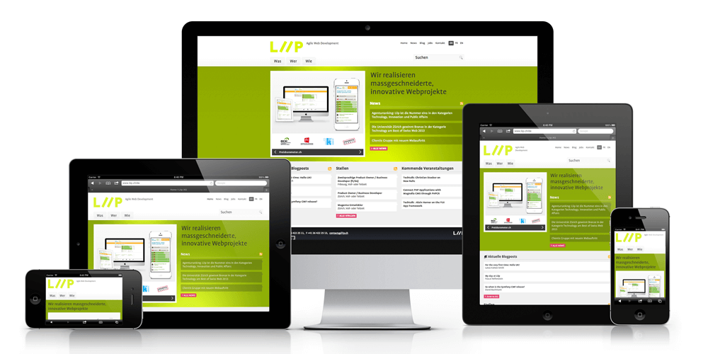
The best and easiest way out is to look into responsive web design solutions and how you can build websites that will benefit every potential user out there. This means a design created for for a 1024×768 setting, must also look good and change to fit the 800×600 setting. With the rise of mobiles as the years go by, you should constantly think of how mobile-friendly your website is from the start. Here are the criteria, you can use for optimizing a page layout for a certain screen size:
1. Web page initial visibility: this will ensure that all key information is visible above the folds, so that the users can see it without the need to scroll. You, therefore, have to determine carefully how many items you will show and how much details you will display for each item to ensure that everything is visible on the web page without moving the page down.
2. Web page readability: this covers how easy it is to read the text in different kinds of columns, given their allocated width.
3. The web page aesthetics: this covers how good your webpage will look when its elements are in the right size and location for the screen size you are designing for. Will the elements line up as they should?
Three principles come together in the creation of responsive web designs:
i) Fluid grids
ii) Fluid images
iii) Media queries
Fluid grids

Websites in the past were designed in terms of pixels, but a lot has changed today in order to ensure that websites are appearing in different format sizes, for instance large formats like the TV screen, smaller formats like a Smartphone screen size or even a much smaller screen size like that of a smart watch. That is why today, websites are built with relative units like percentages instead of fixed units like pixels. Those designers who have always designed in pixels can use the formula below in order to change to using percentages to be able to design for different format sizes:
Target/content= results
Fluid images

This is one of the advancements that have been made in responsive images and it entails shrinking images in order for them to fit within the confines of a fluid grid. This is easy to achieve with just a single line CSS code
img { max-width: 100%; }
The code will tell the browser that every image used in the website should be as large as the pixel value so as to avoid having images that are overstretched, and those that are not very clear in some browsers.
Media queries
This is a CSS technology that has been around for so many years. They are the main components of responsive designs. With media queries, CSS will be applied only if certain conditions are met. If for instance, your design is too large or too small, a media query can be used in order to detect the site width and serve CSS which perfectly rearranges the contents of the site. The width of the screen is the main target here, because websites should fit in the browser window without vertical scrollbars. The height is usually relative, after all, people are already used to scrolling and also because vertical scrolling feels natural a compared to horizontal scrolling.
You cannot ignore the height entirely though, especially for some websites. Just make sure that the most important information is clearly displayed on the above fold, which means that it should be visible without scrolling.
Website dimension is a very important thing in web programming. Every CSS rule should be changed in order to ensure that every user is reading everything in a website with ease. You can for instance change the font, colors, spacing and the images in your website to make a normal webpage look native on a Smartphone or a smaller device. You can also choose to show or to hide some elements, change the column widths and layouts as well as the way your elements look so as to achieve a responsive web design.