Today, any company or entrepreneur needs a website to run their business effectively. But does just having a website guarantee success on the web?
There are over 1.94 billion websites on the internet today. The competition is mind-blowing. To make your website successful, you can’t afford for anything to go wrong. In this post, we investigate the most common web design failures and offer ways to fix them. Continue reading to make sure you haven’t made these mistakes with your website.
#1 User-hostile navigation
Many websites still get navigation wrong. When a user can’t immediately find what they’re looking for, it’s a huge navigation issue. Websites with poor navigation are losing customers and revenue and lowering their search engine ranking. To fix this problem, there’s no need to reinvent the wheel. Just follow common web design standards and stick to design guidelines. Following these basic recommendations will make your website intuitive and comfortable to use.
- Use horizontal navigation and place the most essential categories on the left and the least essential on the right.
- Place your value proposition or the most essential information above the fold.
- Provide a search box in the right upper corner if there’s a lot of content on your website.
- Locate the login link in the header or the upper right corner and put a signup box at the bottom of the page.
- Place social media icons in the footer so as not to distract users but give them the opportunity to share your content.
- Put links to the About us page, FAQ, and site map in the footer.
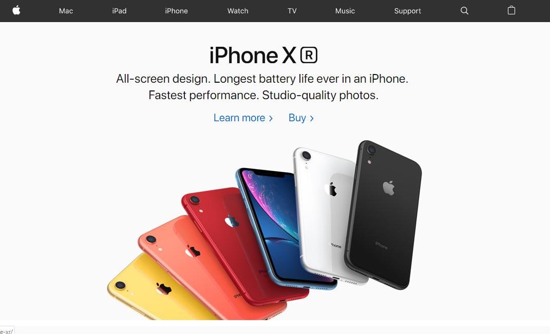
Below, you can see a great example of correctly designed navigation by Apple.
#2 Poor mobile responsiveness
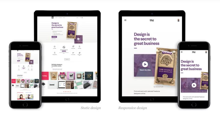
From year to year, the share of mobile traffic is growing. In 2018, mobile accounted for 52% of all traffic, and that percentage is likely to continue increasing. To reach mobile users, your website must be responsive. You’ll benefit from a responsive site in several ways: First, it will improve your SEO, as Google ranks responsive websites higher. In addition, responsive websites provide better user experience, since they look good on all screen sizes. Responsive websites also load faster, so you won’t have to be afraid that users will leave because they have to wait too long.
When starting development, make sure you create a responsive website. Here are some essential things to consider to get a superb mobile design:
- Eliminate friction. The size of mobile screens imposes certain limits; you should only show the essentials to make your website beautiful and readable.
- Use the rule of thumb. Place buttons and CTAs so it’s possible to reach them with a thumb without much effort.
- Make tap targets comfortable to tap. Elements users tap should be 44x44px or larger. Modern mobile phones are pretty big, but it’s important to remember that people mostly use them on the go.
- Use icons for menus and drop-down lists for a cleaner look. Again, you’re limited by the screen size. You can show all the content on the desktop, but make your mobile site laconic.
#3 Annoying ads and pop-ups
Avoid advertisements on your home page. People come to your website to find a solution, so it’s bad manners to show them an ad right away. This definitely won’t help you engage users. Also, avoid pop-ups that cover more than half of your content. To understand if an advertisement is harmful to a website and how it influences your SEO ranking, set up analytics tools and carry out regular audits. Chances are you don’t need the ads on your site at all and they even harm your ratings.
#4 Lack of personality
Illustrations or photos are important since they depict the main idea of your content faster than text can. Moreover, people can remember only 10% of what they’ve read three days later, but relevant illustrations increase this number to 65%. Pictures stay in people’s memory longer than dry information. Another advantage is that custom illustrations make your website stand out. While stock images don’t catch the user’s eye and impact your website’s credibility, high-quality illustrations can engage users and help your brand stick in their memory. They also improve the usability of your website or app: the right pictures or mascots can give an idea of what users can do on a certain page or what information they can find. Well-drawn and carefully selected images make an emotional appeal and make users want to continue interacting with your website.
The use cases for illustrations are endless. Here are some ways you can apply them on your website:
- Home page themes and banners
- Onboarding illustrations and animations
- Images for blog articles
- Infographics
- Mascots
If you’re stuck with a style, it’s not a problem, since many are trendy. Here are the main illustration trends that can give you some fresh ideas:
- Hand-drawn illustrations
- Eclectic illustrations
- Isometric design
- Flat design combined with gradients
- Minimalism combined with bold colors
If you invest in high-quality illustrations or photos that correspond to your business idea, you’ll be rewarded with higher conversion rates and better user engagement. So, choosing a reliable web design company is worth paying attention to if you want to create an outstanding brand personality for your app or website.
Here’s an amazing example of Basecamp illustrations that are recognizable by almost anyone.

#5 Flamboyant design
As we’ve just mentioned, impersonal design can harm your website, since it doesn’t hook users emotionally. But that doesn’t mean you should use all design options in one product to make it catchy. In 2019, there are a variety of web design trends that cater to diverse needs and the requirements of even the most demanding clients. However, vivacious colors, gradients, and different fonts all used on a single page will definitely make users laugh.

In order not to make your website look like a rainbow, follow a few simple rules:
Choose one dominant color
The word “dominant” speaks for itself: this color should show up, since you need it for such elements as your logo, menu tabs, titles, and the most essential information. It usually accounts for up to 60% of your color palette.
Choose one secondary color
This color is used for the current menu tab, subtitles, and to highlight less essential blocks of information. This color usually accounts for about 30% of your palette.
Choose a simple background-color
The background color is like wallpaper in a house. It can be simply white or a very light grey or a fresh vibrant color. It all depends on your business idea and target audience. If you don’t choose white or grey, remember to pick a color that’s a shade of your dominant color.
#6 No timely updates
Every year, new trends in web design appear. That doesn’t mean you should follow all of them on your website, but keeping it up to date is essential. Companies that believe website design and development is a one-time process, attract fewer customers. Don’t neglect to make timely updates to your website.
Moreover, users feel less engaged if they interact with a website for five years and nothing changes. To make your website the best version of itself, regularly update content and make design improvements. This will result in higher user engagement, better conversions, and a lower bounce rate.
If you follow these simple pieces of advice, you shouldn’t face any problems with the user experience or your website performance.
This is great write up, thanks for this mind blowing tips , sure will use