
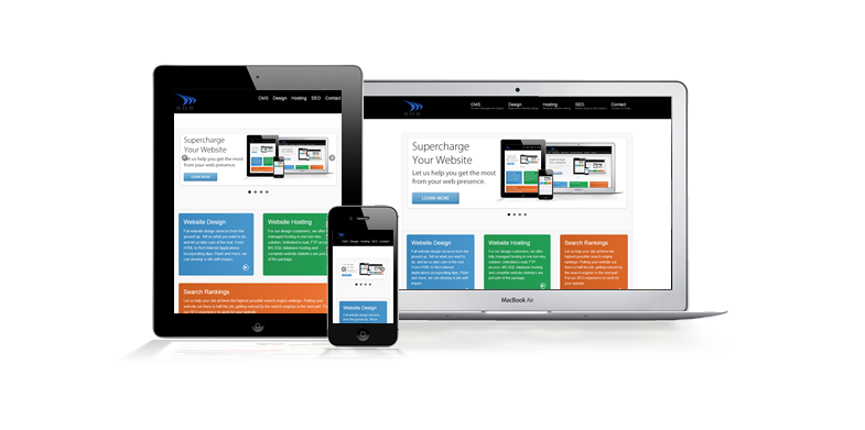
The world has started to shift from desktop computers and now more people are using mobile devices to access the web. Designers have now to think about the user interface as well as user experience in order to design websites that can easily be viewed even in the smallest screens. As the years go by, more and more people are relying fully on their mobile devices, that is why you need to ensure that your website is optimized for mobile devices. This is the only way you can reach out to your targeted users through any platform they are using.
Here are some ways you can make sure that your website is optimized for mobile:
1. Know your users

The very first thing you should do is to determine who your users are. Do not try to serve all people at the same time, as this may cost you valuable clients in the long run. Once you know who your users are, find out what their typical behavior on the web is. When you have this determined, find out what they look for on the internet. Some people browse the web with no purpose in mind while others do it for a purpose. Depending on who your users are, you should be able to provide what they are looking for better.
2. Make all your content available to all your users

There are designers who hide some of the content that is on their websites from mobile users. This happens a lot especially if the layout is not that great. Sometimes they do this when they feel that the content is too much for the mobile user. This denies the user a chance to go through the entire content before making the final decision. It is not fair to give your mobile users a stripped down version of your website. You might even end up losing customers.
3. Work on your page speed

One of the things your users will enjoy the most is if your website speed is good. In many cases, mobile users leave websites that are extremely slow to load without even trying to find out what they are all about. You can optimize your images in order to achieve this. You can also minify your code, leverage browser caching and also reduce redirects. This way, web users can quickly go through your website and learn more in just a few seconds.
4. Design for touch

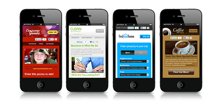
Modern mobile-device users are using fingers in place of mouse pointers to click on the web. You, therefore, have to take a note of this and ensure that your design will be absolutely easy to navigate using fingers of all sizes and shapes. Do not allow your users to press so much in order to get a response, or even to zoom in so as to know where to tap. Do not also allow them to fill out a form, which is a great challenge when using fingers.
5. Create fluid layouts
Fluid layouts are very good whenever you are designing for all possible screen sizes. People are using different kinds of mobile devices; therefore there are so many possible screen sizes from where you need to pick the ones you will be designing for. To avoid blocking some users out, use fluid layouts, because they are able to adapt seamlessly to all those screen types. They are standard among many web developers today because they ensure that as many people as possible are able to view your website with minimal effort.
6. Take advantage of compression tools

These are great in making the work of a designer easier. There are script compressors for instance, which can automatically remove any unnecessary comments, code or even whitespace. For example, HTML compressor and Gzip. There are others like CSS compressors and CSS minifier which can help you concatenate CSS code in order to improve your website performance.
7. Do not hide images, CSS or JavaScript
Years ago, mobile devices were unable to support images, JavaScript and CSS elements, that is why many developers blocked all or some of them. Smart phones are way different because they are designed in such a manner that they can give users the same kind of view that desktop users are enjoying. For this reason, do not hold such elements as they could be important to your website users. They also help a lot for instance in making it easy for search engines to determine whether your site is responsive or not.
8. Maximize on functionality
Functionality is basically what your visitors get from your site in order to get the things they do on it done and faster. To make your website more functional, you should ensure that all the tools that your users will need to perform the intended function are placed strategically and nearer to them to help them achieve their goals faster. A search box is important on a home page, from where users can search for anything they are looking for on your website. You can also make your website as easy to navigate as possible.
9. Optimize for local search

This will be very useful if your business has a local element. Optimizing it for local search will make it easy to get by people who are looking for it within that locality. You can do this by standardizing your name, your address and your phone number. You can also include your city and state in the site’s metadata.
10. Go through developer’s guidelines and libraries

There are guidelines and libraries that you can always look up to in order to determine the kind of guidelines you should focus on so as to give your users a great experience. This always depends on the kind of platform that you are using. There are those platforms that are more flexible than the others. What you should look out for are the key components that can help you design a great website for your mobile users.
Optimizing websites for mobile devices is important because one never knows what device their users are using to access the web.