
Mobile phones have become a must have accessory in the lives of many people today. A lot of people find it hard to stay without a phone and mobile device manufacturers are doing their best to keep up with the high demands. Other than calling, texting and just accessing the web, shopping these days is also done by mobile devices for convenience purposes. Forms are very important whenever one is shopping online. They are a way for sellers to get information about a buyer for delivery, for payment and other reasons. Online shoppers are not thrilled by the need to fill in forms, but it is part of online shopping these days for the buyer to know what you need delivered, where and how you want it delivered. Here are ways you can speed up the performance of your customer’s mobile transactions in order to make their online shopping more exciting: –
1. Only include important details in your forms
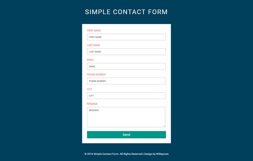
Online shoppers do not have enough patience to fill a whole webpage of forms when shopping online. As a developer, one should not create something that will bore them because you might end up losing a chance to make a sale. Instead of asking for three different phone numbers, a developer should request for one phone number and make the form as easy to fill as possible. This way, your customers will enjoy their mobile shopping and shall also be more than willing to provide the few details required just to get that product they have liked on your page.
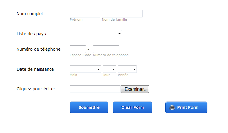
2. Go for single input entities

Split input entities, where shoppers are required to tap on three or two fields in order to answer only one label will backfire on you if your shoppers happen to be short of time. They could also be confusing; therefore simpler forms should be used for mobile platforms.
3. Use of top aligned labels and fields

Due to their small screen size, Smart phones have a limited view when compared to computers. Therefore, it is important for a designer to design a form that can take care of this disadvantage perfectly. You can use a vertical alignment for the fields of your form so as to ensure that everything will fit on the view of the phone.
4. Set scale with viewport meta tag

By doing this, your shoppers will not need to zoom to have a better view of your web page. Zooming might make them lose focus on the page and what is important. Use of a viewport Meta tag on your forms will keep them focused through to the end.
5. Help your customers track their progress

Many people are not so keen on filling forms. It would help a lot if you can provide your shoppers with a way to tell them how close they are to completing their experience. This can be done by percentage or just chronologically. If you have limited their steps, they will happy to fill the form fast. Knowing they are close to completion of the process will elevate their engagement.
6. Making use of collapsible menus an dropdown lists
This will help a lot with the limited view of mobile devices, ensuring that your users will not need to scroll so much in order to see an entire page or fill up the forms. Scrolling through screens is expected when using mobile devices but many users will always prefer a fast means of buying an item online to save them time. They can then find all the information they need in the collapsible menus for a quick read.
7. Formatting your form’s buttons
Understand the most important buttons on your form, such as the submit form, and ensure that they stand out so as to keep your shoppers engaged to the end of the transaction. Make those buttons more appealing by giving it a brighter color and an outline that makes them stand out.
8. Ensure that the forms load fast
The rate at which your mobile forms are loading is a very important factor because if the page will take long to load then you might find it hard to convert a visitor. Take advantage of the fact that your customers have reached the form because this means that they are ready to place an order. If therefore you disappoint them with slow loading forms, they may not come back to buy.
9. Make use of data persistence

Shopping on mobile devices is not always easy. especially if you click to go back to the previous page by mistake or you reload the page. You might end up losing the shopping cart, which is frustrating and time wasting. Many shoppers will abandon the shopping altogether if this ever happens. However, designers can solve this issue by giving shoppers an option of opening anything new they want to open on a totally new tab, without losing the shopping form.
10. Utilization of appropriate list selections

This is the best to use in case you are not able to use the dropdown lists of the collapsible menus. You can either go for open predictive search fields or for locked dropped down lists. The former will allow your customers to input keywords of the item or service they are looking for, and the closest possible results are listed for a perfect selection. The latter on the other hand will list only specific items in the menu following a particular order, and shoppers will pick out what they are looking for with ease.
Shopping on mobile does not have to be complicated and time wasting. Designers can design forms for mobile in such a manner that online shoppers will find it easy and exciting to place an order. It all starts with a simple to fill form, one that only asks for the most important information and your shoppers will quickly fill it to order for what you are selling.
Very nice Article, its very useful to develop mobile application, thank you for sharing this article
Great article and very interesting and understanding..Thanks for sharing this type of article
Really informative! Quite impressing content.
Well mobile application is not that easy. Find an expert to notify your business. Find mobile app development company to build your own customized app for your business.
Great Article! Mobile Apps optimization need to be specialized by experts! So, you need to hire a professional from a mobile app development company to make it set right to reach your business goals.
Simply good article,it’s very useful for me to understand about the mobile applications and the flow of the app. Thanks for sharing