Data visualization enables us to analyze and understand big amounts of data at ease, it would be very difficult to analyze surveys, polls, or simply data just by looking at single records, the digital age enables us to take either libraries, or tools to help us give our data a more visual look.
When I say libraries, I mean the collection that you can find on GitHub; there are so many cool data visualization libraries to work with, but we’re going to be looking at more broader tools, as far as I know – only one or two in this post can be found on that GitHub page.
As the amount of data that becomes available to us grows, more and more people are welcoming smart data analysis software into the market, not only does it help to spot patterns and interesting insights about the given data table; it allows us to use the findings and publish them as blog posts, research papers, essays, etc,. etc,.
Interactive Data Visualization
Your brain is capable of a lot of things, and one of them is the ability to process visual information very quickly – you can read more on that in this MIT article. And, because so many people understand this – they’ve steered away from traditional static and spreadsheet type visualizations, to more interactive stuff like infographics, and charts. Nowadays, any mobile device or laptop computer can be used to produce mind-blowing data visualizations.
Why Care About Data Visualization?
The really big advantage of data visualization is that you’re able to notice and see things that perhaps weren’t there first. Large or small data-sets, quite often you can spot patterns without paying too much attention. Data visualization allows to transform information in an easy and understandable manner, and makes it very easy to pass the ideas to others. You can easily ask questions like ‘What would happen if I removed that piece?’, and it will quickly become evident of what would actually happen.
Data Visualization Mistakes
Data visualization simply means the creation and analysis of data represented visually. Data abstraction and representation is done in various forms with several attributes and variables serving as units of information. Data visualization is considered the best way to understand any given data. However, there are some mistakes that people need to avoid in order to more efficiently understand data. Thank you, Database Friends.
Free Tools for Data Visualization
I think we’ve looked at the very essentials of data visualization, and the post from DB Friends is going to help you to avoid making common mistakes when it comes to visualizing your data. The tools in this post can definitely attract many opinions, so if you feel like you’ve got something to say – leave a comment and we’ll take it from there.
Zoho Reports

Zoho Reports is an amazing platform that will appeal to both individuals, and businesses that need to analyze a lot of data. Don’t worry about different file formats, Zoho allows you to upload all the major filetypes, as well as provides functionality for pulling data from a web URL. Quite convenient if you’re playing with large sets.
The visual analyzer that Zoho has built-in supports a drag and drop interface, which will allow you to quickly and easily create the necessary visualizations for your projects, slideshows, or conference talks. Don’t worry, there are plethora of elements available; charts, pivot tables and tabular view components.
Exhibit

Exhibit lets you easily create web pages with advanced text search and filtering functionalities, with interactive maps, timelines, and other visualizations. Essentially, Exhibit was built for data-rich websites and applications, and has since attracted a very nice following. Ready to explore? Start with the Wiki.
Many Eyes
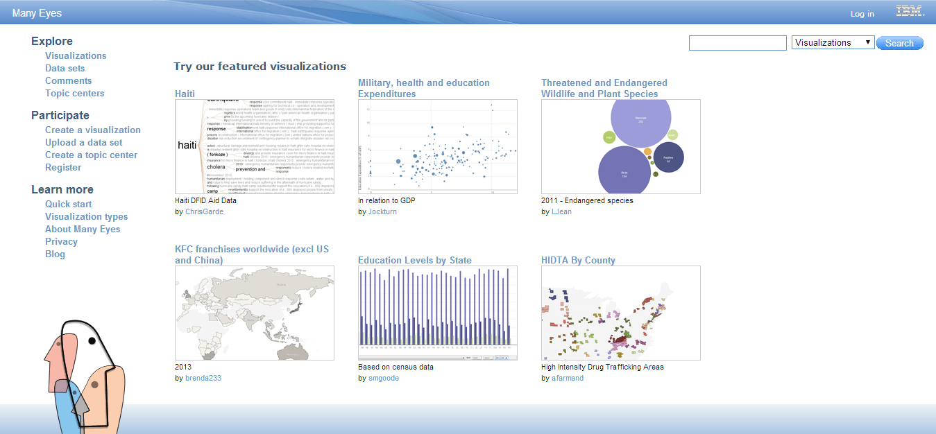
IBM has definitely seen better days, but their old-school data visulization software Many Eyes is still kicking it. Many Eyes is a Java application, so make sure to have it activated once you get to the page. I really enjoy the flexibility and sheer volume of types of visulizations that you can do with this tool: see the full list here.
Gnuplot
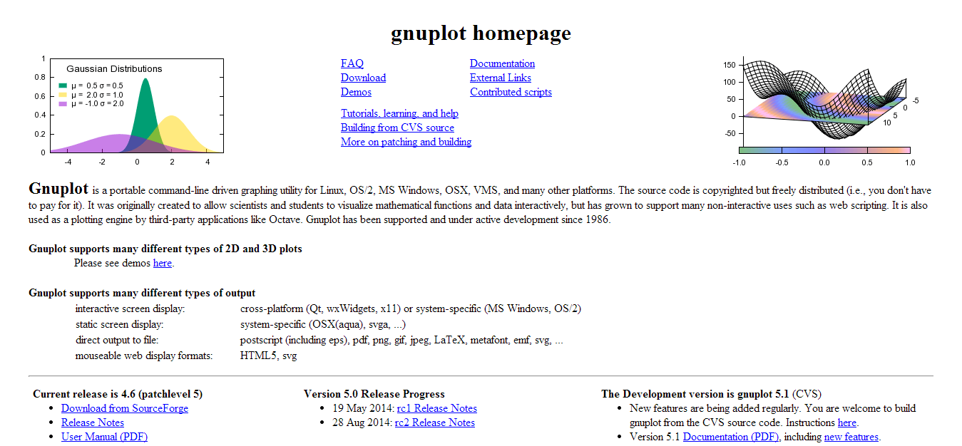
Gnuplot is probably one of the rare command-line tools that can provide an amazing data experience. It works for all major operating systems, and allows to output the visualizations in many formats, including SVG and HTML5. Gnuplot was also one of the tools used by O’Reilly Media to ‘Decode Climate Change‘, definitely check it out to see the many possibilities of this tool.
Gri
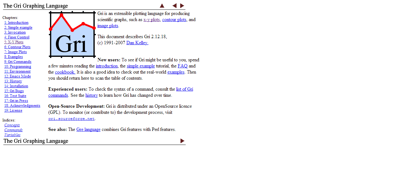
Gri is an extensible plotting language for producing scientific graphs, such as x-y plots, contour plots, and image plots. As I said, not many command-line tools; but here’s one more than will attract those who’re science oriented.
D3.js
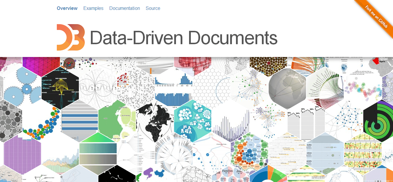
In the recent years, the D3.js visualization framework has become somewhat of a standard for concluding data visualization within pages, applications, and even software. Now, what’s even better is that community is working really hard to make the most of it, like I was just reading in a recent Medium article – a developer has found a way to send D3.js charts over email, how cool is that?
I recommend this quick ten minute guide to get started with D3, I think you’ll really enjoy the flexibility and the endless possibilities that it brings to the table.
OpenGraphiti
OpenGraphiti is a 3D visualization framework that works on Linux, and Mac OS X. You’ll need to have Clang and Python installed in order to play with this tool. You’ll have to scout the OpenGraphiti yourself for examples of how to use it, and also some example data sets to use for testing.
Google Fusion Tables
The Google Fusion Tables are quite new, and definitely have room for growth. Think of the fusion tables as Excel being ported online, but only to serve as a tool for visualizing data. You can create all kinds of layouts with fusion tables, even custom ones; and you can analyze millions of rows if necessary.
OpenRefine
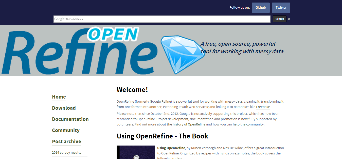
OpenRefine (formerly Google Refine) is a powerful tool for working with messy data: cleaning it; transforming it from one format into another; extending it with web services; and linking it to databases like Freebase. The project was renamed due to Google abandonning it, but the development still continues under the new name, definitely check this one out, grab the book to finish the learning curve quicker.
R Project
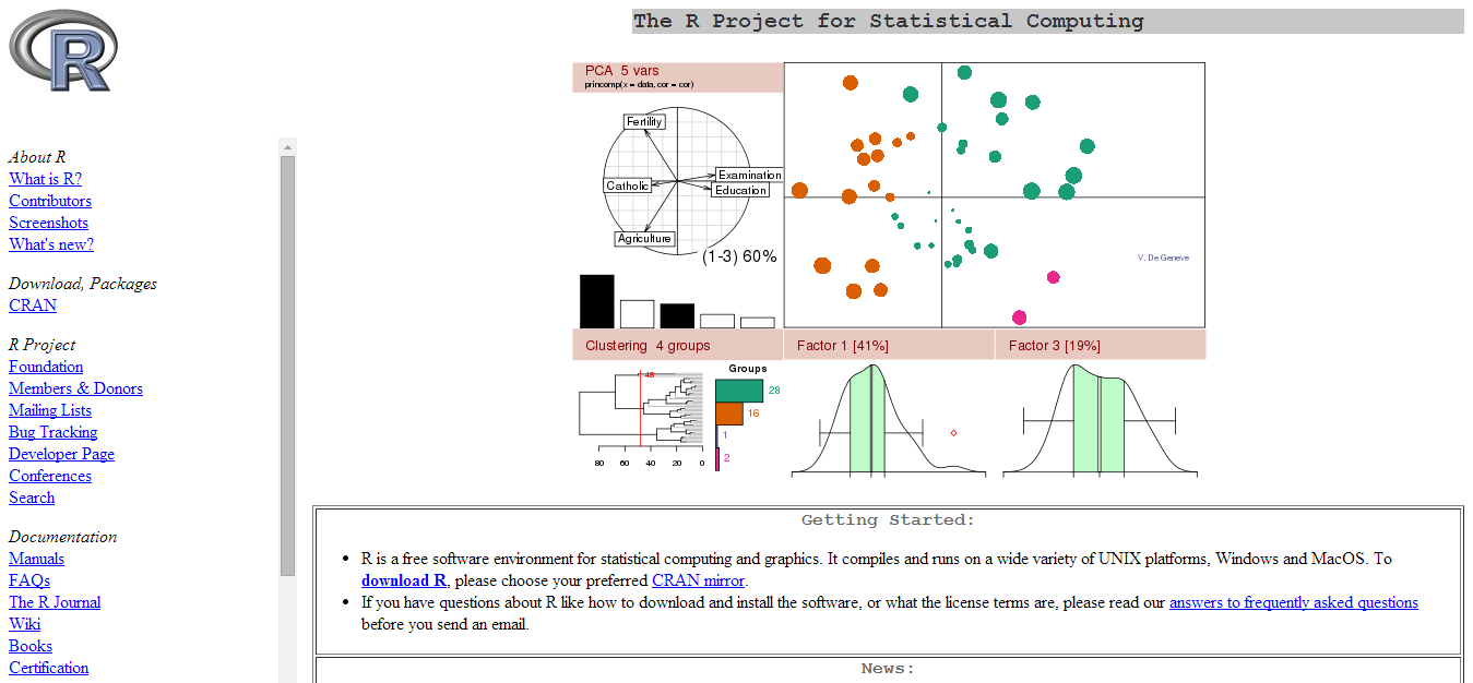
Well, if none of the above are being of any help, why not rely on a specific programming language that was built for visualizing data? That’s right, the R Project is a specific statistics computing language that can work with the most difficult sets of data. Scientists, analysts, brokers, and pretty much everyone else turns to R when they need to sort a big list of data.
I’ll surely be updating this post on frequent basis, including with resources for learning more about each particular tool. I’ve just come across a great resource where you’ll find further links that can help you learn about the R programming language. You’re more than welcome to share your own stories, not only to give them exposure, but to help educate the community! :)
Data Visualization with JavaScript
I don’t think there are patterns here, each tool has something different to offer; even if you’re looking for tiny changes like colors and shapes used for displaying data. In this post, we have Stephen A. Thomas giving us a rundown of how to visualize data using JavaScript, and what are the different implementations of such an approach.
Data Visualization
I’m quite pleased with how the post turned out, there are definitely many options to choose from, and it might take some time to learn them all, but if you’re looking for a quick and dirty solution – definitely check out D3.js and the R Project, because both are popular enough to have plenty of coverage to be found online. What other cool data visualization tools are you aware of, can you share them with us?