Designing for mobile devices is gaining momentum as the number of people using mobile devices increases. These days many internet users prefer to access the web while on the go through their smart phones and tablets, giving web designers a chance to design mainly for mobile devices use as opposed to desktop use. However, it is not an easy task, and web developers can expect many challenges, especially if they have been designing for desktop and laptop users. However, with a few tips, designing mobile websites can get much easier:
1. Be aware of your target audience and their needs

It is important to consider the type of device your users will be viewing your applications in. This will determine your design process as well as your website strategy. For instance, if you are designing for a mobile device, it would be wrong to assume that all your users will be using a tablet to view the site, or a smart phone. You will find that because of this, you will have to accommodate many different users and platforms if you would like to gain a wide reach.
2. Keep your core content the same

Your content will be the most important element of your mobile web design, therefore, do not change the most important content as this will prompt your users to click on the desktop version just to try and understand what you are offering. Some users may even give up if they are unable to find what they need on their mobile devices, which is why the core content should remain the same regardless of the device that your users are accessing your site from.
3. Have the future in mind while designing

Advancements in technology happen all the time, which is why it is hard to expect that the same design you create today to be of great use in a few years’ time. Many new ideas and innovations are developed everyday especially in mobile web development. When designing, web developers need to have the future in mind in order to design websites that will be trendy in a few years rather than having to redesign the website after only a year or two. Think ahead and note that as much as devices will change, their objectives will always remain the same. Therefore, come up with a design that will apply in years to come.
4. Mobile first or desktop first

It is important to know where you are going to start, that is, whether you are designing primarily for mobile devices or for desktop computers. This is largely determined by the kind of app you are designing. There are apps that will call for a mobile only design and there are those that will require both the desktop and mobile designs. If you are designing for mobile only, just ensure that the content can be viewed easily across different devices and screen sizes.
5. Optimize your websites for mobile

Give your mobile users the best experience by optimizing your websites for mobile use. Design websites that will look as great on mobile as they do on desktop computers. Ensure that your content can be seen easily and that interactions are simple in order to give your users a grand experience when using your apps.
6. Stick to UI patterns and guidelines
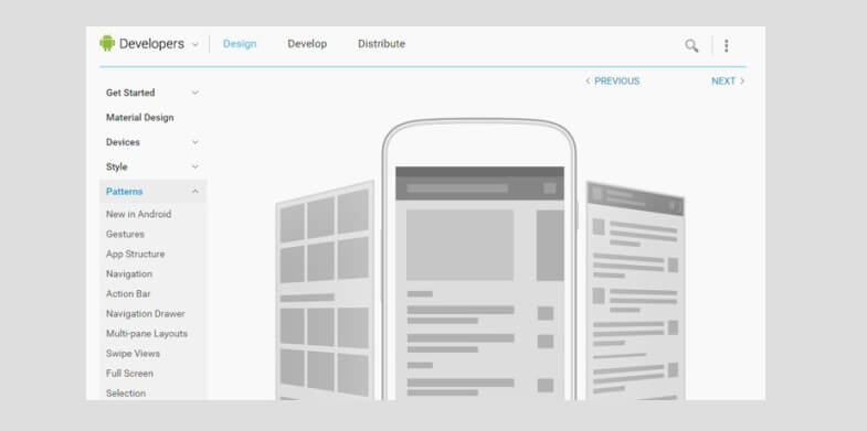
Every operating system has its own UI and principles of interaction that its users have to use. Therefore, whenever you are designing for any device you have to keep these principles in mind. For instance, if you are designing for iOS devices, you will have to use the guidelines and patterns that are exclusive to iOS devices. Understanding all this and learning how to use these patterns and guidelines will make designing your mobile website much easier.
7. Appreciate tasks and contexts

There are so many reasons why people access the web on their mobile devices and it is important to keep these in mind when you are designing your apps or websites. In terms of websites, there are certain websites that people will visit more when carrying out certain tasks as compared to when they are in front of a computer. Consider the surrounding factors too, which would make a person access a website on their mobile device. As much as these factors were not very important years ago, they are important considerations now, especially when you are designing for mobile users.
8. Choose the right app to design

There are different types of mobile web applications, therefore, you have to determine the kind of application you want to design so that you can come up with a strategy on how to design it. Design an app that will be easy for you to create, and one you can easily design with the tools that are available to you. Consider what different mobile apps require, then choose what to design based on that.
9. Look at analytics to know what to design
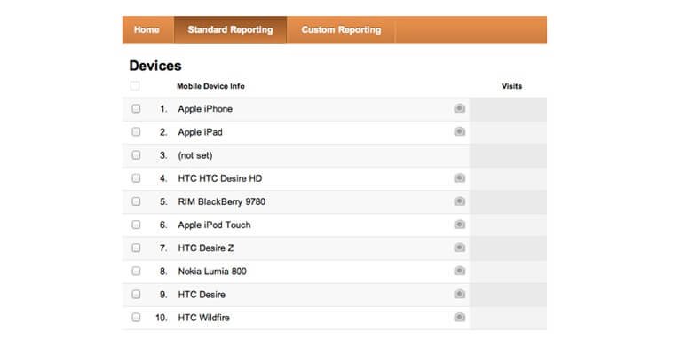
It is not easy to know what majority of people are using these days unless you look at analytics. This is the only way you can know the kind of devices to design for, especially in terms of screen size, version, operating system among other considerations. Using analytics, you will have an idea of the kind of devices that the majority of people are using, versus the kind of devices the majority of people you are targeting are using so as to design websites that will be of great use.
10. Pay attention to navigation
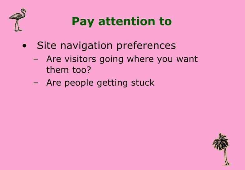
This is one of the areas that many mobile designers tend to ignore, but it is very important when you are designing mobile websites. Mobile users want to be able to navigate through your website in much the same way they would if they were sitting in front of their computers. For this reason, it is important that you ensure that you provide them with just that so that they can keep coming back to your site.

Designing for mobile users is exciting because a majority of internet users today use it through their mobile devices. Therefore, web developers need to have as much information as possible so that they can come up with apps that will improve their users’ experience and make them want more.
These mobile designing tips are very useful.Thanks for the informative article it helped me in completing my research.