What are UX Errors? Lots of new website owners and designers lack an adequate understanding of UX and how it can impact the success of your website or application as a whole. UX (User Experience) errors are errors that occur when a user is not able to interact properly with your website.
According to Don Norman, author of The Design of Everyday Things, there are two major types of UX error; slips and mistakes.
- Slips happen when users perform one action instead of the desired action they wish to perform. For example, clicking the ‘cut’ button instead of the ‘copy’ button. Slips often occur in users that are more familiar with a particular site. This is because they are less likely to double-check their actions because they feel more accustomed to that site and its features.
- Mistakes occur when a user’s mental model of a site doesn’t correlate with what they come across.
While the term ‘UX error’ suggests that the user is at fault. This is not true. The blame rests mostly on the website designer for making it easy for an error to be carried out in the first place. Therefore, the design should be readjusted to make it less prone to errors.
To ensure your design is error-free, here are a few tips you must take into account when designing your website;
1. Follow Design Conventions
‘Users spend most of their time on other sites’
This driving point behind the Jakobs Law still rings true today. When users approach your site, they expect it to function similarly to other sites they’ve been on. When this falls short, slips and mistakes happen.
Making use of standard design conventions helps you to properly evaluate the errors that may happen. It puts the user in a more privileged position to respond to those errors. Every user who interacts with your website has been unconsciously trained by many other websites to expect a particular design format to interact with them in certain ways.
When your site falls short of this expectation, UX errors will occur as a result of the user’s unfamiliarity with the design of your site.
2. Design with the Users in Mind
Even the best designers who have been creating websites for years are often not able to put themselves in the shoes of the users. In order to anticipate future errors, it is important to know what the users want and how they will interact with your website.
There are a variety of user research methods that can be used to understand why users make certain errors and what they expect from you after those errors are made. One way this can be done is through user testing. With user testing, a handpicked number of people are given access to your site. Through them, you are able to access the various errors that are made, their response to it, and how to properly tackle it.
Other research methods such as field studies and ethnographic studies are also useful.
3. Enable ‘Preview’
New users and sometimes old users may not be aware of the impact of the action they just took on their document or file. And some users may want to look through their work and analyze the effect of different actions.
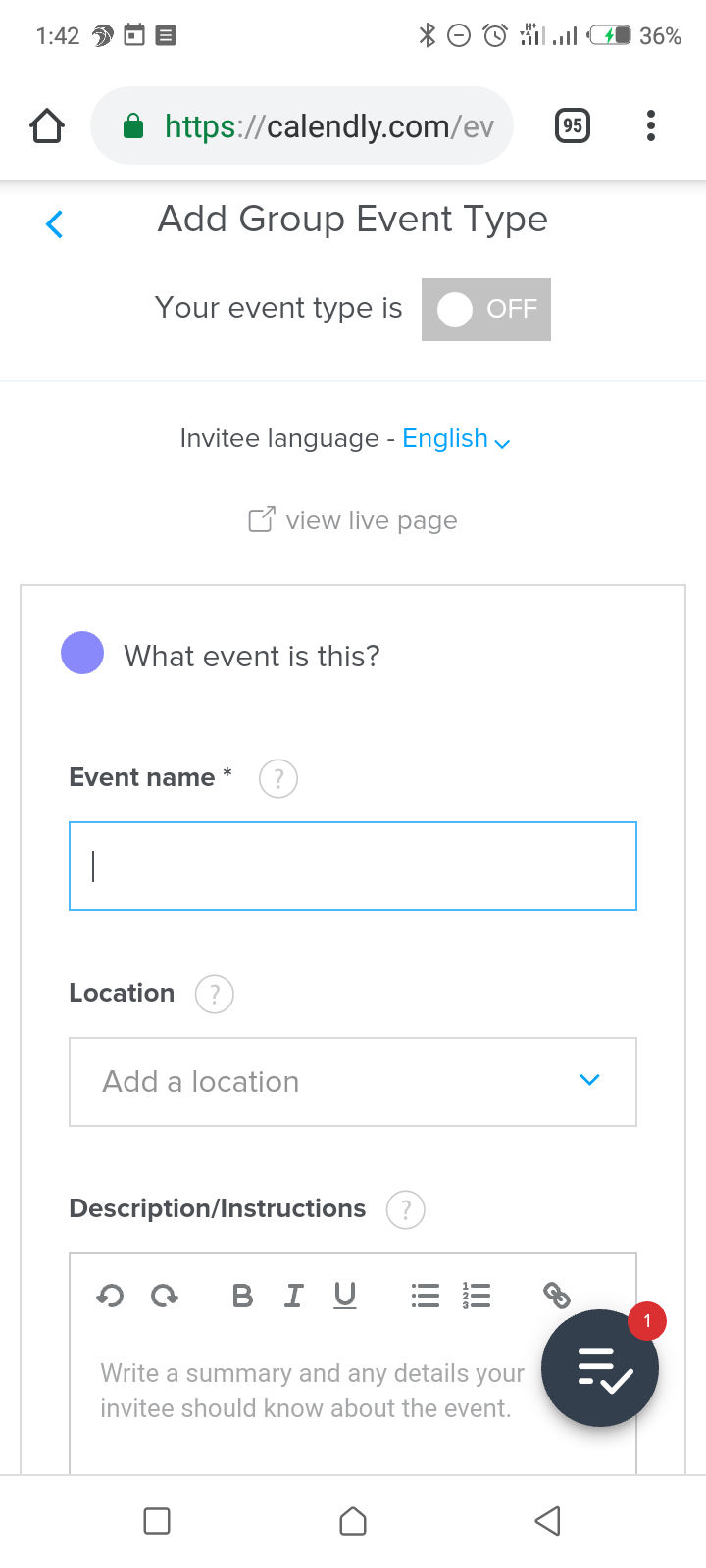
Providing a ‘preview’ button on your site gives your users the ability to do this. Users are given the chance to analyze their work as a finished product and make corrections when needed. In Calendly, the user is offered the chance to view the live page as visitors would see it, at any point during their usage.
This helps to avoid slips and mistakes before they can be made.
4. Communicate affordances
Adequate user and design communication is necessary to produce only the best results for your website and its users. As stated before, using commonly known design conventions is a great way for people to interact better with your website.
Going further than that, it is important to communicate with them in a way that even new users will understand. There are two ways to do this; through spoken communication and unspoken communication.
With spoken communication, the writing on your website is targeted towards a particular group. On this note, a site targeted at upcoming musicians and artists will speak differently than a site targeting single parents in the 21st century. Another word for this is conversational selling. With conversational selling, the users are able to interact with your website on a friendly basis.
Unspoken communication is more subtle, but is no less received by users. For example, when using clickable buttons, the color inside the button is always shades darker or brighter than the color of the website. This tells the users that this button is usable and they can click on it. However, if you leave your buttons the same color as your sites, some users might not even notice its presence at all.
For example, take a look at the following Flickr’s landing page:

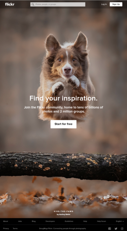
The brand is channeled toward artists with a passion for photography and the website’s language channels this. The words ‘find your inspiration’ is a great way to welcome people to their site. Also, the changing background pictures ensure that every artist gets a glimpse of whatever photography design they are passionate about.
Also, notice that the clickable button is white in contrast to the darker background of the photos. The text ‘start for free’ is also a great way to approach new users. As Flickr is mostly used by normal people with a passion for photography, this is better than the usual ‘Join Now’ most sites use.
5. Confirm before destructive actions
Most designers tend to focus on tasks that lead to content created by the user. But creating a simple and easy way for users to delete unwanted documents is also important.
However, it is not uncommon for users to delete items they still use on accident. So, before you completely delete an object, ensure you confirm with the reader that that is the right action they want to perform.
For example, the google photos app uses a two-step verification before deleting photos. The app even goes the extra mile by adding a trash can for deleted photos to go to, before finally deleting them permanently.
Some other popular platforms such as Netflix lack such design elements. Thus, if users were to accidentally delete their downloads, there would be no warning or going back.
However, it is important to use confirmation boxes carefully. If a user is constantly being asked ‘are you sure you want to do this?’ before every action, they may grow irritated and may even leave your site!
Also, the more users come across these confirmation boxes, the less meaning it will have for them. They will begin to click confirm without going through their work, and this will generate more UX errors on your platform.
The best thing to do would be to limit this design to actions that could have lasting and sometimes, permanent effects on the users’ work. Along with these confirmation boxes, implement other methods of preventing UX errors that are discussed in this article.
6. Support Undo Button
Despite all the preventive measures you’ve put in, UX errors will occur from time to time. When this happens, it is important to provide a straightforward way for users to undo their actions without having to restart their work.
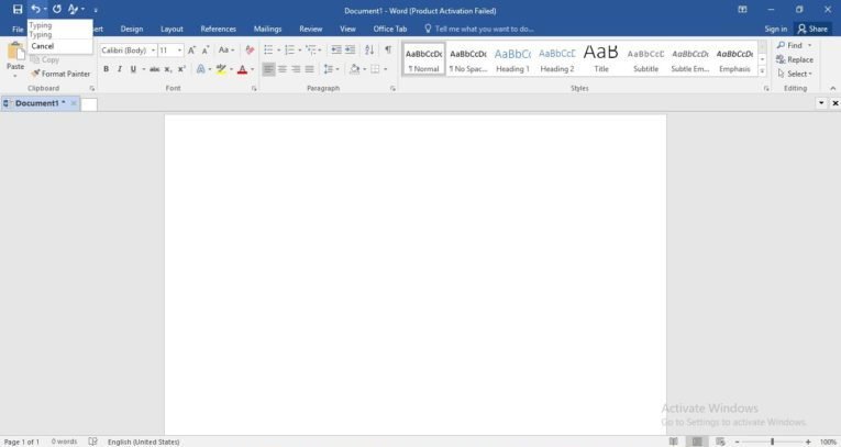
All Microsoft products make use of this design element. So, users are able to retract the actions they have made whenever they want.
With Microsoft Word, users are even offered a drop-down list of their actions. So, they can pick the exact action they wish to undo.
With the undo button, the users are not burdened with having to restart their work from the beginning. Instead, they can retrieve it and continue from where they left off.
7. Be Specific with Instructions
Never assume your users know what they are doing. Try to implement as many short messages as you can. This helps your users navigate their way around your site.
For instance, someone using a film making app for the first time will be presumably unaware of how to get started with their work. But, having small pointer signs such as, ‘post picture here’, or ‘adjust audio here’ will help them navigate their way around.
With this retirement savings calculator – users are given clear instructions in the form of communication, using phrases such as “I make” ($50k per year) – this format leaves little room for error as it directly addresses the situation of the user
When doing this, avoid using vague signs as this may confuse the users even more, and cause unnecessary frustration.
Conclusion
Although users will always make mistakes no matter what you implement. It’s not impossible to reduce the occurrence of these mistakes and improve the user’s experience. Prevent errors easily by making simple design upgrades and communicating adequately with your users.
These simple guidelines ensure better productivity, improved user and product communication, and the long term success of your website.