
The way your web pages have been designed can have a significant impact on the amount of business that you’re going to be dealing with on daily basis, modern internet users hardly bother with undeveloped/under-designed web pages that don’t provide a seamless browsing experience. You can sit here all day, read articles about responsive web design, but that isn’t going to bring you any closer to a killer user experience.
In todays world, web design is more than just fancy looking widgets and icons that outline your logo and perhaps the face of the founders of the particular startup, last couple of years have brought in psychology into the way sites get designed, all for the benefit of both the consumer and the seller. Here’s a great article from Google Ventures that look into this particular area, explaining how to design killer websites that will convert visitors into long-lasting customers.
If you’re an aspiring startup owner and need some advice on how to design a great landing page for your products, you’ve come to the right place. I’ve put together ten of the best startup website designs that I’ve found so far, I’ll accompany each with a small description, but to experience them in full glory you will have to visit each one individually. To disclose: all of these startups are meant to inspire, but also teach you what works for others, and what kind of areas to explore on your own webpages.
1. Stripe
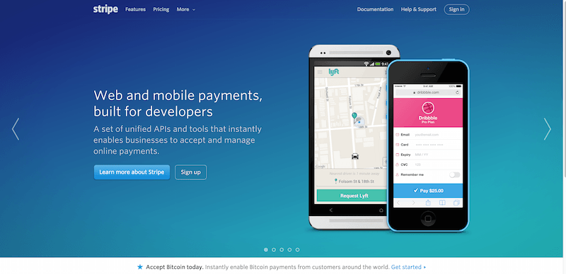
Stripe is a payment processor and gateway, which means that not only do they have to come off as a well-designed webpage right off the bat, they’ve also got to secure a position as a secure company that can protect the data of its customers, especially potential ones. Their product pages are filled with wonders of JavaScript that define the way future websites are going to look.
2. Patchmania
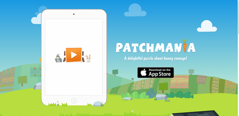
Patchmania by itself is a puzzle game, but the website is a great example of how a product can be directly incorporated within the pages of your website, even though it may look just like a background wallpaper — with a couple of JavaScript widgets, and some well-aligned design features; the webpage clearly reflects what the game is like, and what it is about.
3. Bellroy
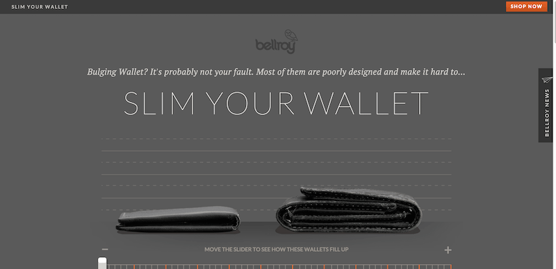
Are you into wallets? Can’t say that I am either, usually I stick with a wallet for two or three years before I have to find a new one. This Bellroy website gives a great example of how a product can be demo displayed directly from a product page. You can use the navigation bar to see what your current wallet would look like packed with money and cards, versus what it would look like if you begin to use the Bellroy product. Neat!
4. Leesa
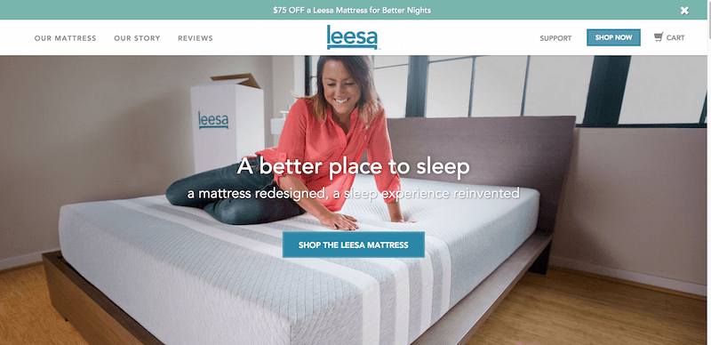
Learning to combine simple with elegant takes time to master, but someone at Leesa has definitely got that skill up their sleeve. The homepage is comfortable to browse, offers all the details about the product, and even displays some advanced features — such as being able to see what the layers of the Leesa product look like.
5. Nest
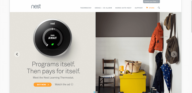
Nest is a gigantic company, mostly because Google decided to acquire it, but also because their products are top of the line. Their website integrates a cartoonish feel that’s both modern and appealing, the choice of colors are encouraging to continue browsing the site; but what else did you expect from a company that has access to world class designers, their products speak for themselves.
6. DistroKid
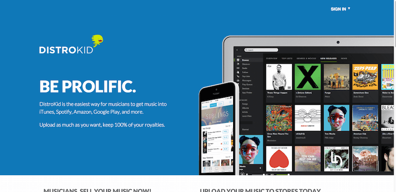
If you’re on a budget, but still want to make somewhat of a difference — here is DistroKid, a music selling service for the indie artist, the initial homepage is so simple that it screams elegance from all of the corners. The first screen is a preview of what the inside of the product looks like, while the next one as you scroll down is a simple signup page; outlining the benefits of those with member access.
7. Square

Semantic design enthusiasts will love this landing page. It’s packed full of information, but the use of smaller fonts really make this particular landing page what it is — an exceptional perfection of a good designer. Rundown of features in such a way that you experience the product before you even get access to it.
8. ReadMe
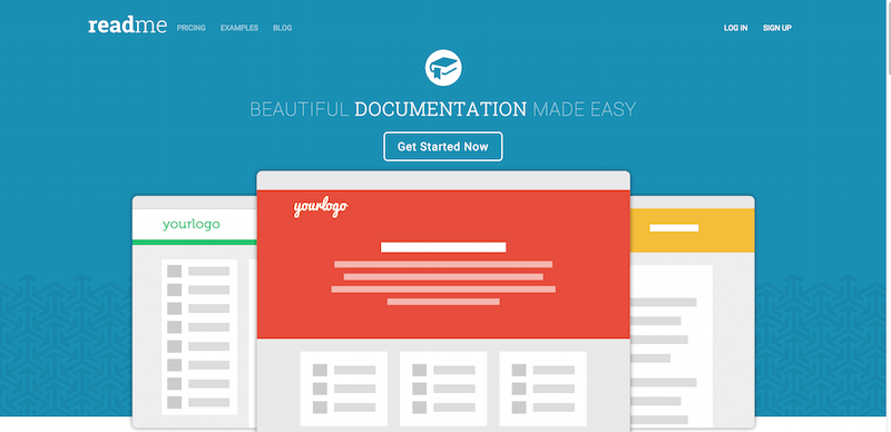
The best thing about ReadMe is that it explains the product within a single homepage, but also all the animated icons and special effects on different elements of the site, it’s those little things that make the biggest difference, and nothing beats an interactive website. It keeps you motivated to keep browsing.
9. Pexeso
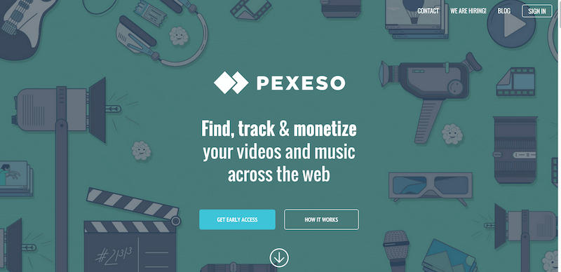
I love it, it’s like playing a tiny video game — you get your own little screen, and all the tiny little icons and gadgets is your way of learning about the product, seeing what it can do for you. Not only does it save space in terms of text usage, it provides a visual learning experience — and we all know how those go.
10. Carousel
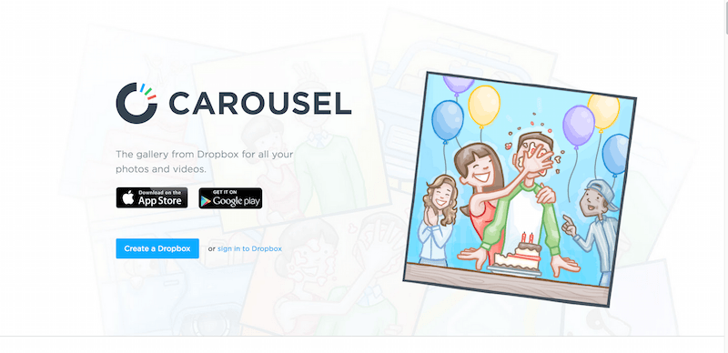
The last landing page on our list comes from Dropbox and their product Carousel. The website unfolds as you keep scrolling down, in a way that really goes to show the capabilities of modern design and what it entails.
Best Landing Pages from Startups
As I said at the start of the post, it’s difficult to transfer these experiences into words, even if we decided to use more images, you’ve to immerse yourself into these landing pages and see the different types of effects and design features that they use to provide a fantastic browsing experience.