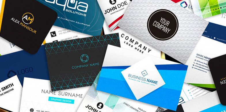
The lifespan of a business card usually isn’t long. Once it’s created, it typically spends most of its time in a box with its brothers and sisters or in someone’s wallet or purse until it is exchanged like a trading card. In which case, it goes in someone else’s wallet or purse, or joins others in a pile or stack in a desk drawer – if it’s lucky.
In most cases, the sad truth is most business cards will end their lives in the trash, their beauty admired for less than five minutes before they were tossed aside. But that doesn’t have to be the case. You can break this cycle and give the business card a pardon with a unique design that will make people think twice about throwing it away. We asked a team of experienced business card designers for some tips to save business cards from a terrible fate. Here’s what they told us:
1. Shape
A traditional business card is a 3.5” x 2” rectangle, but you can completely disregard conventional shape and size and make it a circle or square instead. You also could have the card shaped like something that connects to the business such as a hair brush or handheld mirror for a hair stylist, or a guitar or microphone for a musician. But keep in mind this could limit your space for information.
You also could keep to the traditional size and general shape of the rectangle but use rounded corners or cut small parts out. For example, make the card look like a camera for a photographer and cut parts out on top to account for the buttons, or cut along the sides to make the card look like a movie ticket for a theater owner or director.
2. Utility

Another way to save the life of a business card is to make it do something besides being just a business card. This will make people want to keep the card longer.
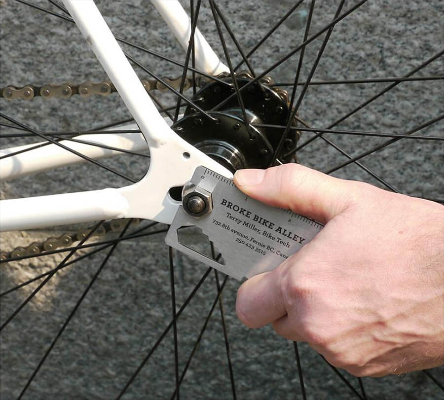
For example, Broke Bike Alley bike shop made its business card double as a wheel nut wrench. By making it a tool, cyclists were more likely to keep it, and when repairs beyond tightening a nut were needed, they had the repair shop’s information handy. An optometrist might use his business card to double as a magnifying glass, or a handy man could use the edge of his business card as a ruler. It could even be something as simple as having the card double as a magnet. Then, people will see it every time they open their refrigerator.
Adding information people will want to reference later also is a good way to give a business card utility. For example, a sports bar might want to include the schedule of the local teams on the back, or a floral shop could include a list of holidays and leave room for customers to write down special birthdays or anniversaries. You also could use the other side as a loyalty punch card or a coupon.
As more people choose to digitally save information from business cards, some businesses have come to terms with the cards’ inevitable fate and found away to give the cards new life by using plantable cards. These cards are made of biodegradable material and have plant seeds embedded in them so that they can be planted when people don’t need them anymore. Plus, the plant is a constant reminder of the business.
3. Texture
Most business cards have a smooth texture, but making them feel a little different helps them stand out in the pile. The change could be as subtle as an embossed logo or a foil stamp. If you want to go a little bigger, you could use thicker stock for the card, or suede-like soft-touch coating. You also could change the material of the card altogether to a hard plastic or even metal.
If your client doesn’t want the extra cost of changing the texture, you can always give the appearance of a different texture. This also will make the card stand out because people will be inclined to touch it to see what it feels like. Just be careful not to make the design appear too busy.
4. Color
The last thing you should be mindful of when designing a standout business card is its color scheme. Colors have the power to evoke a variety of emotions in people.
Warm red and orange colors typically get noticed more than the cooler colors. That’s not to say there isn’t a place for family of cool colors, as blue represents feelings of trust, security and calm, while green signifies growth, wealth and nature. And, if it’s a sophisticated, formal look of luxury you’re going for, you should use black, gold or silver.
Be sure the background colors don’t clash with the colors in the logo, text or images. If they do, the only thing they will evoke will be a trip to the trash.
Business cards have it rough. So much time and effort can go into their designs only for them to perish in the garbage. Designers have the power to save them, and hopefully, with the help of these tips, you will. Do you have any other tips? Please leave them in the comments below.