
In recent years, while building a website more stress has been put on web designing. In order to differentiate your website from the sea of websites on the internet, you must create a user experience that is eye catchy. This does not mean that functionality has no role to play in a website, it is just the fact that web designing is also equally important.
Web designing can be extremely complex as the design should be both visually coherent and technically sound at the same time. Without understanding the purpose of your website it can’t be built to serve all the objectives. There are many websites built with same objectives but only some of them are popular mainly due to their unique style of design which relates to user.
Even the most experienced web designers commit mistake and this is how they keep on growing. The ultimate aim of website is to satisfy the customer, which demands a highly intuitive user interface. As soon as the user lands on your website, they make an impression in their mind of what they see and there are high chances that the user will stay on site if they have a good impression. Even by keeping small things in mind you can build a great website. So, here we have a look at 10 mistakes a web designer make while designing a website and how to avoid them.
No Search Box
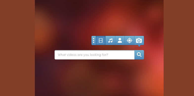
No matter what is the purpose of your website or whom it is targeting, search box is a must, it acts as a lifeline when you don’t know where to navigate. A search engine must be able to handle plurals, typos, special symbols like comma, hyphen, semicolon etc. Search can be advanced but a simple search is always preferred with a simple search box.
Also See: 7 Sites Where You Can Share Your Portfolio as a Designer
PDF Files for Reading
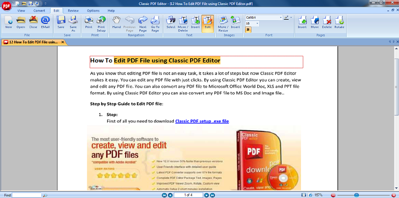
Often users come across PDF files while browsing which disrupts their flow. The layout of these PDF are suitable for sheet of paper and is not meant for standard browser view, thereby involves a lot of scrolling and zooming due to small fonts. PDF is meant to facilitate printing therefore any information that needs to be browsed should be converted into web pages.
No Color Change for Links Visited
Links hold the key to smooth navigation of your website. Highlighting the links already visited makes it easier to traverse the website. Moreover it also takes the weight off your mind, as the visitor can exclude links which were not useful and revisit the fruitful links.
Also Check: 10 Platforms for Creating Animations
Illegible Text
A page full of text with some unconventional font style can be a very boring experience for the readers. To engage readers use tricks such as subheadings, keywords, inverted pyramid, bullets etc. You can also use different color schemes to improve readability.
Poor Navigation
Though there are no standards defined for navigation in a website but the navigation must be consistent without any dead links. A textual description should be provided for all the links. Personal websites can be structured in many ways but a business website must be clear and efficient.
Also Read: 7 Tips for Web Design Freelancers Who Want to Remain Relevant
Disabled Font Size Option
As scripting is becoming more popular there are lot of advanced options available for developers. Now a developer can disable “change font size” button at client side. The users with poor eyesight have no option other than to read the tiny font size which reduces the readability significantly. The font size should be allowed to resize in relative terms rather than absolute number of pixels.
Inconsistent Design
Sometimes designer over emphasize their creativity in designing the web pages. They create different designs for every web page rather than going for a same design pattern for every web page on website. The user tend to remember the website more which has consistent design and are less likely to leave the website.
Flash in Excess
Use of flash can give life to your website by adding advertisements banners, animations and more. It provides functionality which are almost impossible to achieve with the help of HTML. Flash if used in excess makes your site heavy and not everyone has the bandwidth to support such a heavy website.
Also See: 5 Tips for Designers Who Want to Earn More Money
Not Monitoring the Site
There are numerous free tools available in the market which provides you with some valuable information regarding the users visiting your website. With these tools you can track which links are popular and the ones which have become obsolete. The data collected from these tools facilitate designers to make necessary changes into website.
Lengthy Registration Form
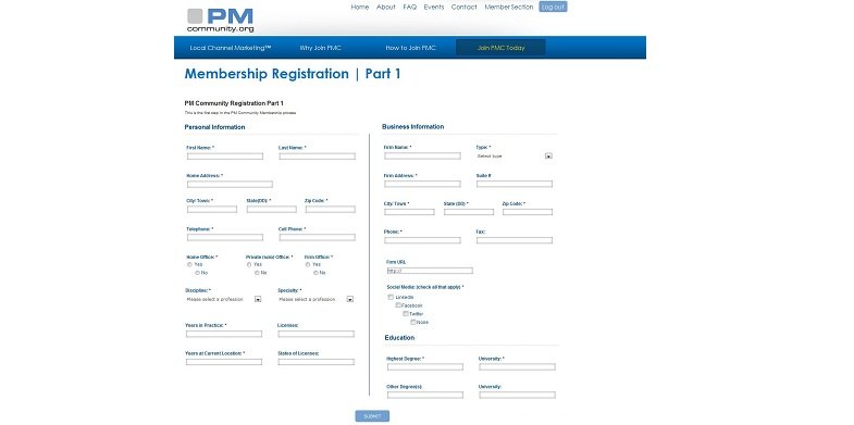
Sometimes the registration form has too many fields marked as mandatory which irritates the user to an extent that they leave the website. The form has too many validations which increases the confusion and the user is not able to fill it at one go. So, the form should have only important fields and should not ask for any personal information.
With more focus on web development, the success of your website majorly depends on how well is it designed and how engaging it can be to the user. After going through the article you can design your website without falling into a trap of common designing mistakes.
Are you also familiar with some common mistakes we commit while designing a website; then you must have something to add to this list? Feel free to leave a comment below to let us know of some improvement areas we can work on while building a website.
A lot of them make me cringe! Great list :)
It really irritates me when a website has no searchbox or if the navigation is missing or is not working properly for each pages.